 how-to
Curating a Gallery Wall: Art for Creative Spaces
Last Updated: November 1, 2026
Quick Summary
Curating a gallery wall for creative spaces starts with measuring the wall and marking the usable zone from about eye level to roughly 60 inches off the floor before buying any art. Then pick one shared thread, such as a frame finish or color palette, and keep spacing consistent so the group reads as one display.
- Measure wall width, height, furniture clearances, light sources, and door swings before buying frames.
- Pick at most two frame finishes and repeat one of them at least twice.
- Keep 2 to 3 inches between frames in a tight cluster and 3 to 4 inches in a looser arrangement.
- Place the anchor piece at eye level and keep the lowest frame above desk height.
- Renters can hang a full gallery wall with adhesive strips, ledges, leaning frames, or tension rods.
Table of Contents
- Start With the Wall: Measure Before You Curate
- How to Mix Art and Frames Without Visual Clutter
- Gallery Wall Layout Ideas for Creative Workspaces
- Gallery Wall Templates You Can Copy
- Gallery Wall Spacing: The Numbers That Matter
- Lighting, Glare, and Accessible Placement
- Renter-Friendly Hanging and Budget-Friendly Sourcing
- Choose Your Focal Piece From Susan Fielder Art
- Frequently Asked Questions
Start With the Wall: Measure Before You Curate
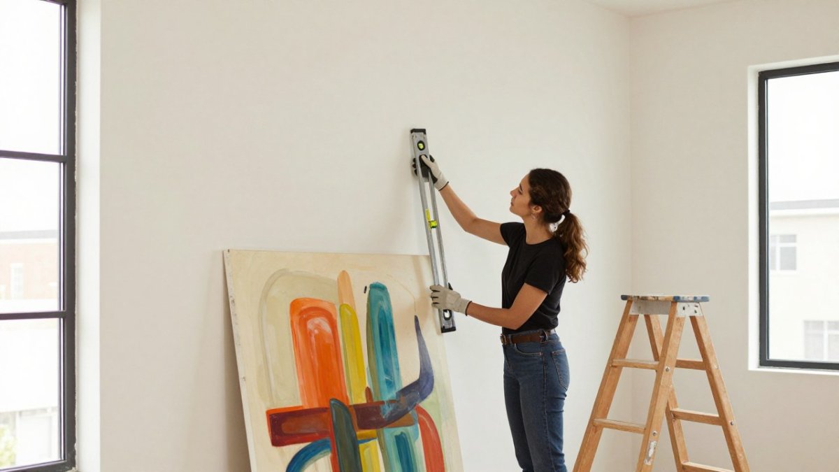
Curating a gallery wall for creative spaces starts with a tape measure, not a shopping cart.
A common mistake is buying art first and hunting for wall space afterward. Reverse that order.
Measure these four things before you buy a single frame:
- Total wall width and height
- Any furniture the art must clear, like a desk or shelf
- Light sources: windows, lamps, overheads
Sketch the wall on paper and mark each item. Now you know your canvas size.
Cooper Hewitt's guide to hanging and installing art notes that hanging height and wall proportion shape how a whole arrangement reads.
How to Mix Art and Frames Without Visual Clutter
A gallery wall is a grouped display of artwork arranged as one visual unit.
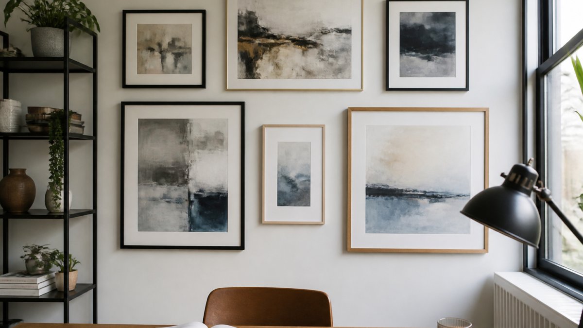
Our rule of thumb: pick two frame finishes at most. Black and natural wood. White and brass. Then repeat one of them at least twice.
For the art itself, mix mediums freely. Paintings, prints, photographs, and illustrations can share a wall when the color palette ties them together.
- Repeat one frame finish at least twice
- Keep matting consistent or skip it entirely
- Let one bold piece anchor the group
Want a deeper walkthrough on blending styles? Our guide on how to curate a gallery wall with mixed styles breaks down the curation process step by step.
Gallery Wall Layout Ideas for Creative Workspaces
Creative spaces have a different job than living rooms. Your wall should feed the work, not just decorate it.
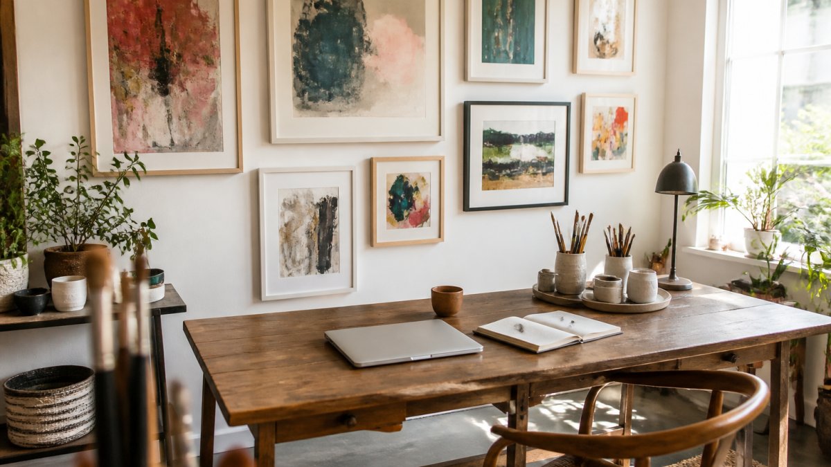
Start with a focal point: the largest or boldest piece, placed at eye level. Build outward from there. Keep the pieces you look at most, like references or mood boards, within easy sight of your desk.
Before you pick a layout, map the wall to the work that happens in front of it:
- Video-call zone. Whatever sits directly behind your camera is your background. Keep that band calm: one anchor piece plus one or two supporting works, with even spacing and no clutter at head height. A busy salon cluster behind a webcam reads as visual noise on a small screen.
- Desk sightline. The pieces you glance at while thinking should sit at seated eye level, roughly 48 to 54 inches from the floor when you are at the desk. Reference images and mood boards belong here, not above the door.
- Standing and pacing zone. Work you want to study up close, like studies or process pieces, can sit lower or off to the side where you can step back from it.
Three layouts that work well in workspaces:
- The anchor grid: one large piece centered, smaller works in a tight grid around it. Best for the video-call wall because the symmetry stays tidy on camera.
- The ledge row: frames resting on a picture ledge above the desk, easy to swap. Best when you rotate references or in-progress work weekly.
- The salon cluster: many small pieces packed close, ideal for sketches and studies. Best on a side wall you view up close, not behind your camera.
A few workspace-specific trade-offs worth planning for:
- Leave at least 6 inches between the bottom of the group and the desk or monitor so the wall does not crowd your work surface.
- Keep frames clear of the swing path of doors, closet doors, and chair backs. A frame knocked crooked every morning will not stay level.
- If your desk faces a window, put the busiest part of the wall on a side wall instead of the wall behind the monitor, where glare and backlighting fight the art.
Working with a tight wall? Our DIY gallery wall layouts for small spaces shows arrangements built for limited wall area.
Gallery Wall Templates You Can Copy
Gallery wall templates are pre-set arrangements you can scale to your wall.
Template 1: The classic grid. Four to six same-size frames in even rows. Measure the gap between frames, keep it identical everywhere, and center the whole block on the wall.
Template 2: The center-out cluster. Place the largest piece first, then balance smaller pieces around it.
Template 3: The shelf row. Lean frames on a ledge or shelf instead of hanging them.
| Template | Best For | Pieces | Effort |
|---|---|---|---|
| Classic grid | Clean, calm walls | 4-6 | Low |
| Center-out cluster | Mixed sizes | 5-9 | Medium |
| Shelf row | Renters, rotating art | 3-6 | Low |
Trace each template on paper first. Cut paper to the size of each frame and tape the shapes to the wall.
Gallery Wall Spacing: The Numbers That Matter
Gallery wall spacing is the distance between frames and the gap between the art and surrounding edges.
A good starting point is to keep these spacing guidelines in mind:
- 2 to 3 inches between frames in a tight cluster
- 3 to 4 inches between frames in a looser arrangement
- At least 6 inches between the group and furniture below
Keep the gap between frames identical everywhere. Uneven spacing is the fastest way to make a wall look accidental.
Leave negative space around the whole group. A gallery wall needs room to breathe, so do not run frames to the ceiling or the corners.
Lighting, Glare, and Accessible Placement
Lighting decides whether your gallery wall looks alive or flat. Most guides skip this, and it is where creative spaces gain the most. A workspace adds a second problem: the light has to serve the art and the screen at the same time.
Manage glare before you hang
Watch for glare first. Glass frames facing a bright window can reflect strongly at certain times of day. Test each spot at different times of day before you commit.
- Check the wall at mid-morning, mid-afternoon, and after dark with your normal lamps on. The wall that looks fine at noon can be a sheet of glare at 4 p.m.
- If a frame reflects a window or a monitor, shift it sideways rather than lowering it. Moving a piece out of the reflection line usually solves more than changing the frame.
- Consider non-glare glass or acrylic for pieces on a wall that faces a window. It reduces reflections but can slightly soften fine detail, so reserve it for larger, bolder works.
Light the art without lighting the screen
- A picture light mounted above the frame throws light down the face of the art and keeps it off your monitor. Aim it at the top third of the piece, not the center.
- Angled floor or desk lamps work for low clusters, but keep the bulb out of your line of sight and out of the camera's view on video calls.
- Avoid placing art directly opposite a window if you can. Backlighting silhouettes the piece and strains the eye.
- If the wall sits in shadow most of the day, a single picture light on the anchor piece is usually enough. You do not need to light every frame.
Place art where people can actually see it
Placement rules that keep art both visible and reachable:
- Hang the center of the arrangement at about eye level for most viewers.
- Keep the lowest frame above desk height so nothing blocks it.
- Leave reachable pieces lower if you rotate art often.
- Add a picture light or angled lamp for walls in shadow.
Accessibility matters too. If someone in the space uses a wheelchair or is shorter, lower the whole arrangement a few inches. Art nobody can see is art nobody enjoys. A useful test: sit in the desk chair and in any wheelchair used in the space, then check whether the anchor piece's center falls within your natural sightline. If it does not, adjust before you drill.
Renter-Friendly Hanging and Budget-Friendly Sourcing
Renters can build a full gallery wall with zero nail holes. The options are better than most people think.
Damage-free methods worth trying:
- Adhesive strips rated for the frame's weight
- Picture ledges mounted with removable brackets
- Leaning frames on furniture or the floor
- Tension rods or rail systems
Check the weight rating on every adhesive product and add a safety margin.
On budget, mix new pieces with thrifted frames and prints. A good frame transforms an inexpensive print.
Our guides on hanging abstract paintings without nails and affordable ways to display abstract art cover both paths in detail.
Watch out: adhesive strips fail on textured, painted, or freshly painted walls.
Choose Your Focal Piece From Susan Fielder Art
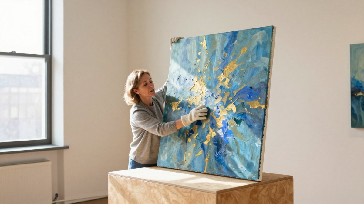
Every gallery wall needs one piece that stops the eye. Choose it first, then build the rest of the wall around its colors and mood.
Susan Fielder Art offers original abstract paintings, and 10 percent of all proceeds go to pancreatic cancer research. That gives your focal point a story worth telling.
Our iPlaid series raises awareness for pancreatic cancer. Hang one as the center of your wall and let smaller works echo its palette.
If you are picking a piece for a creative workspace, browse our collection to see how one painting can set the tone for an entire wall.
Start with the anchor. The rest of the wall will follow.
Frequently Asked Questions
How do you plan a gallery wall layout before hanging anything?
Measure the wall's width and height first, then mark the outer boundary with painter's tape. Cut paper templates for each frame and tape them to the wall so you can judge balance and negative space at eye level. Stand back and photograph the arrangement, then adjust before any nail goes in. Floor layouts work too: arrange pieces on a rug or carpet in the same footprint as the wall, and shift them until the spacing feels even.
What is the best spacing between pictures on a gallery wall?
Aim for 2 to 3 inches between frames as a starting point, and keep that gap consistent across the whole wall. Tight spacing (around 2 inches) makes the group read as one unit, which suits a dense photo wall or a small wall. Wider gaps of 3 to 4 inches let each piece breathe in a large room. Measure the gaps with a ruler rather than eyeballing them, since small inconsistencies show up once the pieces are hung.
How do you mix different frame styles without it looking messy?
Pick one element to repeat and let the rest vary. Common anchors are frame color, mat width, or artwork palette. For example, keep every frame black or natural wood but vary the sizes, or keep matting uniform while mixing thin and wide profiles. Colorful mats can tie mismatched frames together. Limit yourself to two or three frame materials total, and repeat at least one across the wall so the group feels intentional rather than accidental.
How do you hang a gallery wall in a rental without losing your deposit?
Use removable adhesive strips rated for the weight of each frame, or small nail holes patched with spackle and a touch of matching paint at move-out. Command-style hooks work well for lightweight prints and photographs, while heavier framed art may need anchors. Keep every piece within the wall's safe zone, avoid hanging anything over a doorway, and photograph the wall before you start so you know exactly what to restore when you leave.
Your wall is measured, your template is taped up, and the only thing missing is the piece that holds it together. At Susan Fielder Art, every original painting is one of a kind, arrives from a verified secure checkout, and supports pancreatic cancer research with each purchase. Find the abstract piece that speaks to your space and build the wall around it. Get started with Susan Fielder Art and give your creative space a focal point with a story behind it.