 how-to
How to Curate a Gallery Wall With Mixed Styles
Table of Contents
- Start With a Unifying Theme or Visual Thread
- Gallery Wall Layout Ideas: Planning Your Arrangement
- How to Choose Frames for a Gallery Wall
- Gallery Wall Spacing and Hanging Tips
- Balancing Artwork Sizes, Shapes, and Scale
- Using Color and Repetition to Connect Varied Pieces
- Gallery Wall Templates and Layout Tools
- Common Mistakes to Avoid
- Frequently Asked Questions
Last Updated: October 20, 2026
Start With a Unifying Theme or Visual Thread
Learning how to curate a gallery wall with mixed styles starts with understanding that every successful one rests on a single thread that ties everything together.
A unifying theme doesn't mean everything looks identical.
Think of your theme as the invisible connector: a warm color palette running through abstracts, photography, and prints, or the feeling each piece evokes, energy, calm, resilience.
Your theme could be:
- A color story (golds and deep blues, for example)
- An emotion or mood (strength, serenity, joy)
- A subject or concept (nature, resilience, movement)
- A material quality (textured, metallic, matte finishes)
- A style era (modern, vintage, eclectic contemporary)
The strongest galleries use emotion or color as their thread, instant cohesion without feeling forced. Once you've identified your theme, every piece should reinforce it, even if styles, sizes, and frames vary wildly.
Gallery Wall Layout Ideas: Planning Your Arrangement
How you arrange your pieces matters as much as which pieces you choose. The layout determines whether your gallery wall feels intentional or accidental.
There are two primary approaches: grid layouts and organic arrangements. Each serves a different purpose and works best in different spaces.
Grid Layouts vs. Organic Arrangements
A grid layout uses evenly spaced rows and columns, with pieces the same size or following a predictable pattern. Grids feel formal, structured, and modern, ideal for minimalist spaces or a curated-collection look.
An organic layout is asymmetrical and free-flowing, with varied sizes and no rigid spacing pattern. Organic arrangements feel natural, dynamic, and personal, perfect for eclectic spaces or a wall that feels like it evolved over time.
Neither is "better", it depends on your space and aesthetic. A small apartment might benefit from a grid's visual order. A larger living room might shine with an organic arrangement's energy.
Mapping Your Wall Before Hanging
This is where most people skip ahead and regret it later. Mapping takes 20 minutes and saves hours of holes and frustration.
Here's how to map your gallery wall:
-
Measure your wall space. Use a measuring tape to find the height and width. Note any obstacles: windows, outlets, furniture placement.
-
Gather all your pieces. Lay them on the floor in front of your wall. This is your working area.
-
Arrange on the floor first. Move pieces around until the layout feels balanced. Check how the arrangement looks from different angles and distances.
-
Trace or photograph your layout. Use kraft paper cut to the size of each frame. Tape it to the wall in your planned arrangement. Or take a photo of your floor layout and reference it while hanging.
-
Mark the center point. Most gallery walls look best when the visual center sits at eye level, approximately 57-60 inches from the floor.
-
Plan spacing. Aim for 2-3 inches between frames. Consistent spacing creates rhythm.
This planning step transforms your gallery wall from "I hope this works" to "I know exactly what this will look like."
How to Choose Frames for a Gallery Wall
Frames are your silent storytellers. They either amplify your artwork or compete with it. When you're mixing styles, frame selection becomes even more critical.
Mixing Frame Styles and Finishes
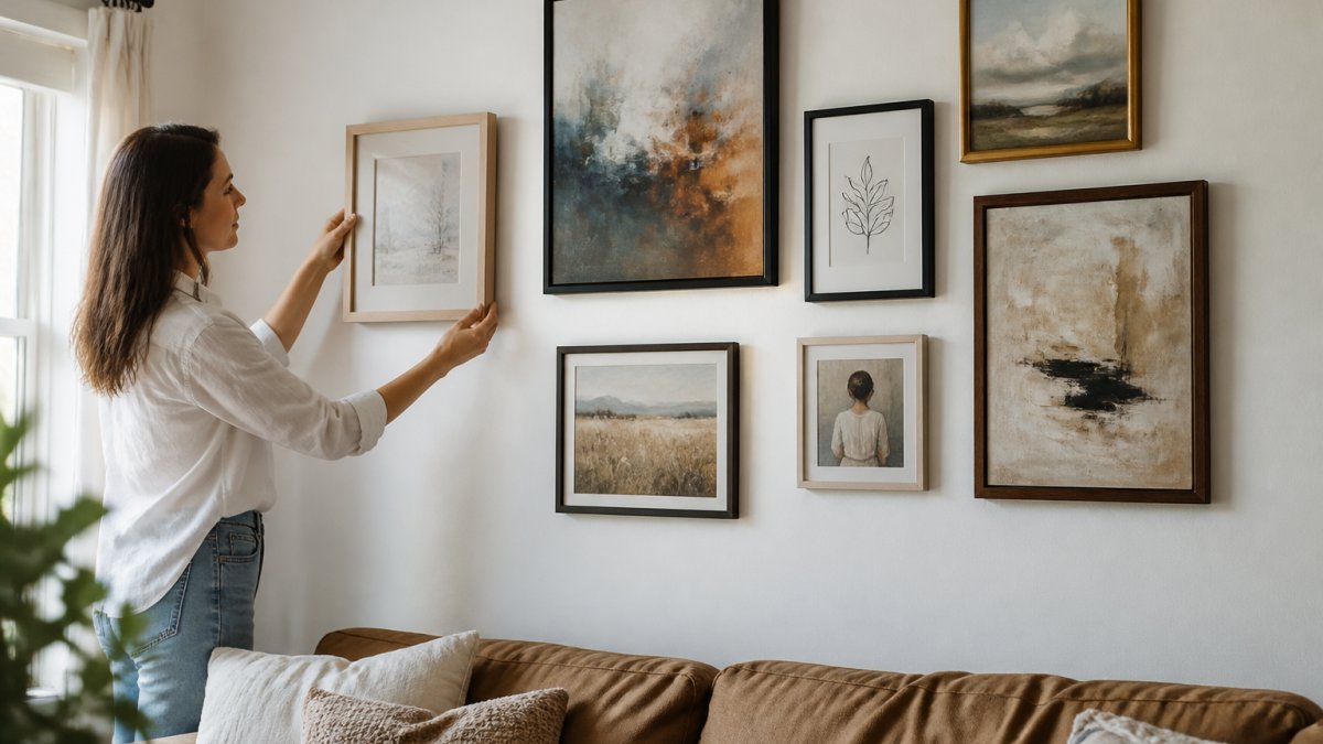
You can mix frame styles confidently if you follow one rule: limit your variety to 2-3 dominant frame styles.
For example, you might combine:
- Modern thin frames with vintage ornate frames (the contrast creates interest)
- Minimalist black frames with natural wood frames (both feel contemporary but offer texture)
- Matte black with brushed gold (metallic finishes add sophistication)
The key is intentionality: mix two or three styles deliberately to create visual rhythm, not five because you couldn't decide.
Repetition is your ally. If you use a gold frame for one piece, use it again elsewhere on the wall, this creates cohesion even when other elements vary.
Balancing Frame Color and Artwork
Your frame color should complement or contrast with your artwork, never fight it.
With abstract art, you have freedom: bold pieces can handle strong frame colors, while softer, minimal abstracts work better with neutral frames that don't compete.
Consider these pairings:
- Vibrant abstract art + black or natural wood frames (lets the art shine)
- Subtle, muted abstracts + warm gold or brass frames (adds richness)
- Colorful photography + white or light frames (creates clean separation)
- Mixed media pieces + frames that echo one color from the artwork
Emotionally charged abstract pieces work beautifully in both bold and subtle frames because the emotion reads regardless of frame choice, the frame becomes an extension of the piece, not a distraction.
Gallery Wall Spacing and Hanging Tips
Proper spacing and hanging technique separate an intentional gallery wall from a haphazard one.
Measuring and Marking for Precision
Before you hang a single nail, mark your wall accurately.
Here's the step-by-step process:
-
Find your starting point. This is usually the center of your wall or the center of your layout. Mark it lightly with a pencil.
-
Measure from the center outward. Use a measuring tape and level. Mark where each frame's hanging point should go.
-
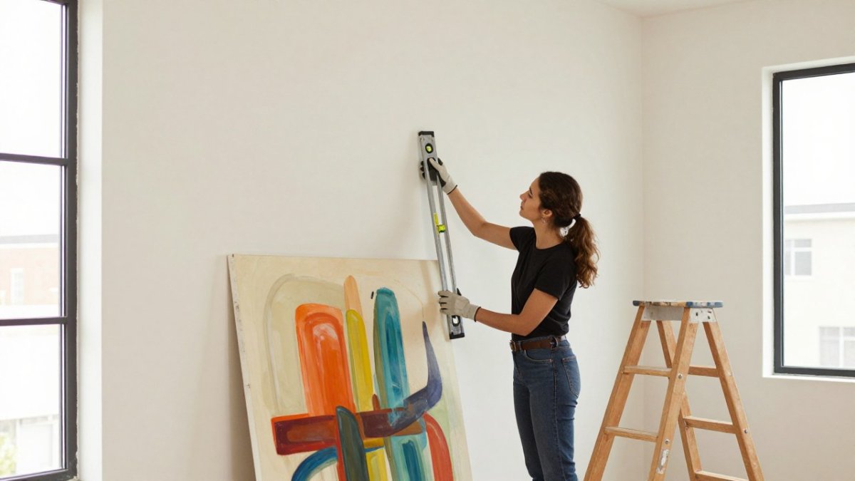
Use a level for every piece. A crooked frame breaks the entire composition. Check both horizontal and vertical alignment.
-
Mark lightly with pencil. You'll erase these marks later. Use light pencil marks, not pen.
-
Double-check spacing. Measure the distance between frames. Aim for consistency, 2-3 inches is ideal for most gallery walls.
-
Step back before nailing. Look at your marked wall from different distances. Make adjustments before you commit to holes.
Taking time here prevents the frustration of removing frames and patching holes.
Renter-Friendly Installation Methods
If you rent, you need methods that won't damage walls or your security deposit.
Command strips and damage-free hooks work for lighter frames, hold surprisingly well, and leave no damage when removed properly.
Adhesive nail alternatives come in various weight capacities. Check the weight of your framed pieces and choose the appropriate strength.
Floating frame systems use wall-mounted rails with no visible nails, ideal for renters because the mounting is minimal and easily patched.
Sawtooth hangers are lightweight and work well for frames under 10 pounds. They're nearly invisible and cause minimal wall damage.
For heavier pieces, use standard nails in studs, then patch the holes carefully before moving out.
Balancing Artwork Sizes, Shapes, and Scale
When you combine different sized pieces, scale becomes your organizing principle. Without it, your wall feels chaotic.
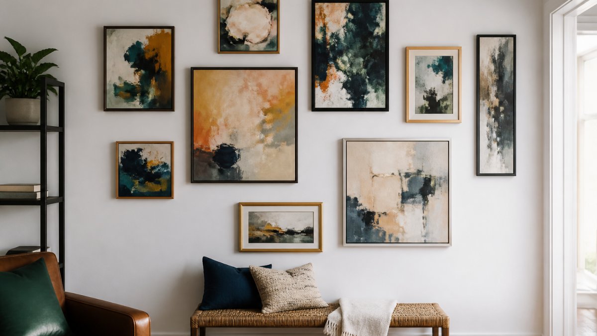
Scale refers to the size relationship between pieces. A balanced gallery wall typically includes:
- 1-2 statement pieces (larger, 24x36 inches or bigger)
- 3-4 medium pieces (11x14 to 18x24 inches)
- 2-3 small accent pieces (5x7 to 8x10 inches)
This 1-3-2 ratio creates visual interest without overwhelming the space.
Shapes matter equally. Mix rectangular, square, and portrait-oriented frames for rhythm; if every frame is horizontal, your wall feels monotonous.
Here's where to place different sizes:
- Statement pieces anchor the composition. Place them slightly off-center or as a visual focal point.
- Medium pieces fill the space around your statement pieces. They're your workhorse pieces.
- Small pieces create detail and draw the eye into specific areas.
The strongest gallery walls don't follow rigid symmetry. Instead, they balance weight visually. A large piece on one side might be balanced by two medium pieces on the other. Your eye perceives this as balanced even though it's not symmetrical.
Using Color and Repetition to Connect Varied Pieces
Color is your most powerful tool for creating cohesion in a mixed-style gallery wall. Repetition amplifies that power.
Color repetition means echoing the same color across multiple pieces. If your first piece features deep blue, include blue again in another piece two sections away.
You don't need primary colors everywhere. Subtle color echoes work beautifully.
Saturation consistency matters too. If you mix highly saturated, vibrant colors with muted, desaturated tones, your wall feels disjointed.
Accent colors are your detail layer. These are colors that appear in only one or two pieces. They add personality without breaking cohesion.
Abstract paintings often feature rich, emotionally vibrant colors that naturally create strong visual threads across mixed-style galleries.
Gallery Wall Templates and Layout Tools
You don't need to reinvent the wheel. Templates and digital tools make planning faster and more accurate.
Paper templates are the simplest approach. Cut kraft paper or newspaper to the exact size of each frame.
Digital layout apps let you upload a photo of your wall and arrange digital frame representations on it. Many are free or low-cost.
Online gallery wall generators create custom layouts based on your preferences. You input your wall dimensions, number of pieces, and style preferences.
Sketch on graph paper if you prefer analog planning. Draw your wall to scale. Sketch each frame to scale.
Whichever method you choose, the benefit is the same: you see your gallery wall before you commit to it.
Common Mistakes to Avoid
Most gallery wall failures come from predictable mistakes. Knowing these helps you avoid them.
Mistake 2: Inconsistent spacing. Varying gaps between frames make your wall feel accidental. Measure. Use spacers.
Mistake 4: Ignoring the wall itself. Your wall color affects how your gallery reads.
Mistake 5: Skipping the planning step. Jumping straight to hanging is the fastest path to frustration.
Mistake 6: Mismatched frame quality. Cheap frames next to expensive ones creates visual discord.
Understanding how to curate a gallery wall with mixed styles is fundamentally an exercise in intentionality.
The result is a gallery wall that feels curated, personal, and sophisticated.
Frequently Asked Questions
How do you create a mixed-style gallery wall that actually feels cohesive?
The key is choosing a unifying element that ties everything together. This can be a consistent color palette, a repeating frame finish (like all matte black or all natural wood), or a shared theme in the artwork itself. When you curate a gallery wall with mixed styles, repetition of one strong visual element prevents the display from feeling scattered. For example, abstract paintings in wildly different styles can feel intentional when every frame is the same width or when all pieces share similar tones within your color story.
What is the recommended spacing between frames on a gallery wall?
Most designers recommend 2 to 3 inches between frames as a starting point, though this depends on your wall size and the total number of pieces. Consistent spacing creates visual rhythm and prevents the wall from looking crowded or chaotic. If you're working with a smaller wall, you can reduce spacing to 1.5 inches; larger walls can accommodate 3 to 4 inches. The critical step is measuring and marking all positions before you hang anything, using a level and painter's tape to map out your gallery wall spacing and hanging tips for accuracy.
Should all the frames on a gallery wall match?
No, frames don't need to match, and mixing frame styles and finishes is actually a modern approach to gallery wall design. You can combine metal, wood, and painted frames in different colors as long as they're tied together by a visual thread. A successful mixed-frame gallery wall often uses the same finish (all matte, all glossy) or the same color family (all warm metals, all cool tones) even when frame styles vary. This balance between variety and cohesion is what makes a curated gallery wall feel intentional rather than accidental.
What tools or templates can help me plan my gallery wall layout?
Several methods work well: print-to-scale templates, digital design apps, or the traditional paper-cutout method. Many people use free online gallery wall layout tools or apps that let you upload your wall dimensions and artwork images to visualize the arrangement before hanging. Another practical approach is cutting kraft paper or newspaper to the exact size of each frame, taping them to your wall with painter's tape, and adjusting until the arrangement feels right. This low-risk preview method helps you avoid drilling unnecessary holes and ensures your gallery wall templates and layout tools match your actual space and personal style.