 blog
Best Abstract Art Styles for Office Spaces: 2026 Guide
Table of Contents
- Why Abstract Art Works in Office Spaces
- The Best Abstract Art Styles for Office Spaces
- Abstract Office Wall Art: Formats and Materials That Last
- Abstract Art for Home Office: Creating a Productive Retreat
- Large Abstract Art for Office Walls: Sizing and Placement
- How to Choose Office Wall Art: A Practical Decision Framework
- Color, Mood, and Productivity: What the Evidence Says
- Conclusion
- Frequently Asked Questions
Last Updated: October 18, 2026
Why Abstract Art Works in Office Spaces
Abstract art is non-representational artwork that uses color, shape, line, and texture instead of recognizable subjects, and it suits offices because it adds visual interest without demanding interpretation. At Susan Fielder Art, we see how a single bold canvas changes the feel of a room. Neutral and earth-tone abstract prints rank among the best-selling wall-art styles heading into 2026, according to Buywallart's best-selling wall art roundup, and textured pieces are drawing fresh attention in the same period.
That matters for a workspace. A landscape painting asks you to look at a specific scene. An abstract piece asks you to feel a mood, and mood is what a room full of people runs on.
The Best Abstract Art Styles for Office Spaces
The three strongest abstract art styles for office spaces are geometric abstraction, minimalism, and abstract expressionism, each fitting a different kind of work. Choosing among them comes down to the energy you want the room to carry.
| Style | Visual Character | Best For | Watch Out For |
|---|---|---|---|
| Geometric abstraction | Grids, hard edges, repeating shapes | Focused, analytical work | Can feel cold without warm tones |
| Minimalism | Restraint, negative space, one or two colors | Calm, client-facing rooms | Too sparse in large blank walls |
| Abstract expressionism | Loose brushwork, layered color, movement | Creative and collaborative teams | Busy pieces compete with busy desks |
Geometric Abstraction: Structure and Order
Geometric abstraction builds images from squares, circles, and clean lines, often echoing cubism's fractured geometry. It reads as organized and deliberate, which suits finance, legal, and engineering offices where precision is the point. Hang one where people concentrate rather than where they brainstorm.
Minimalism: Calm and Clarity
Minimalism strips a painting to its essentials: restrained color, generous empty space, and one strong gesture. This is the quietest of the abstract art styles, and it works best in reception areas, small meeting rooms, and anywhere a client sits and needs to feel at ease.
Abstract Expressionism: Energy and Movement
Abstract expressionism trades control for motion, with visible brushstrokes and layered color that seem to shift as you walk past. Studios, creative agencies, and collaborative spaces benefit most. A common mistake is hanging a large expressive piece behind a monitor wall, where the movement competes with screens all day.
Abstract Office Wall Art: Formats and Materials That Last
Canvas prints and framed prints are the two practical formats for abstract office wall art, and the right pick depends on light and traffic. Canvas arrives ready to hang with no glass to glare under overhead lighting. Framed prints offer crisper edges and easier cleaning in high-touch areas like hallways.
Texture is trending too. Gelato's 2026 art trends report notes growing interest in textured art, and that texture pays off in offices with hard surfaces and flat lighting. One caveat: keep canvas out of direct afternoon sun, since fading shows up fast on saturated colors.
Abstract Art for Home Office: Creating a Productive Retreat
For a home office, choose abstract art that separates work time from home time. A piece you see only from your desk becomes a cue that the workday has started.
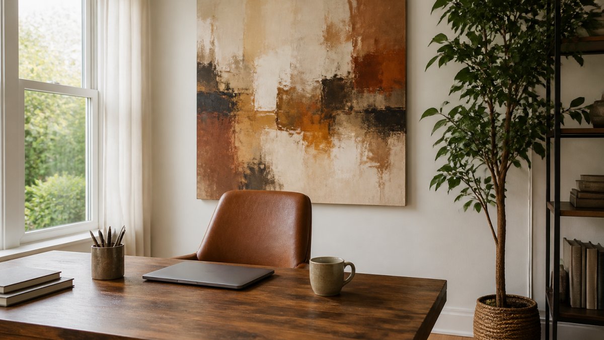
Warm neutrals, terracotta, and soft beige keep a small room from feeling loud on video calls. If your desk faces a wall, hang the piece at eye level so you look at color, not blank paint, between tasks.
Large Abstract Art for Office Walls: Sizing and Placement
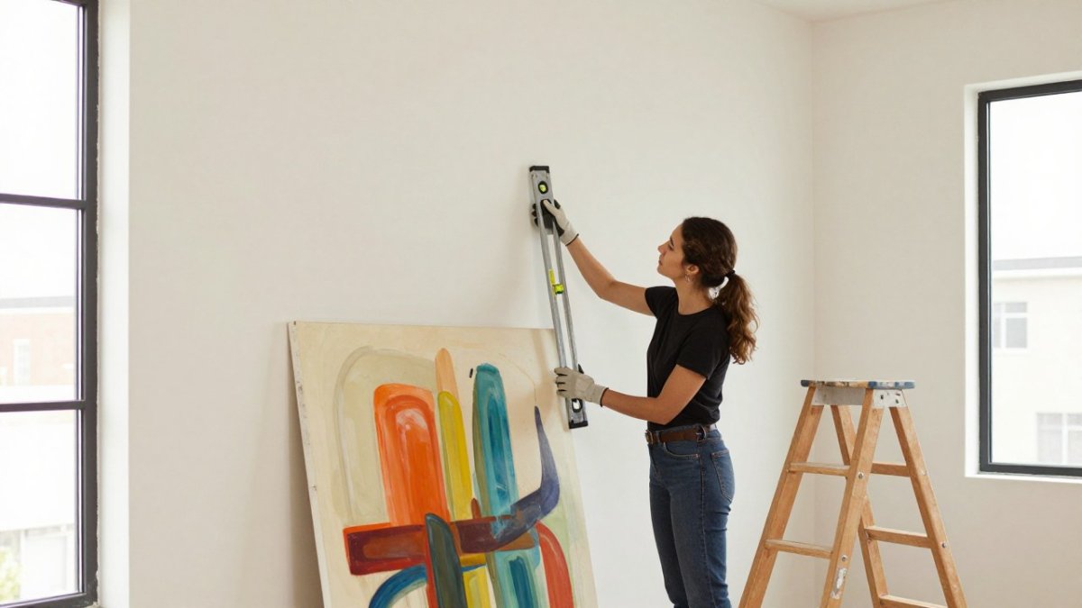
Large abstract art for office walls works best when you size it to the furniture below and hang it at a height that matches how people actually use the room. The common rule of thumb is that a piece should span about two-thirds to three-quarters of the width of the sofa, credenza, or console beneath it. In inches, that means a 72-inch credenza pairs well with a canvas roughly 48 to 54 inches wide, and a 60-inch reception desk pairs with a piece around 40 to 45 inches wide. Leave at least 6 inches of breathing room on each side so the art does not crowd door frames or adjacent shelving.
Hanging height depends on the setting:
- Above a desk or workstation: center the piece at roughly 57 to 60 inches from the floor, which puts the visual middle near seated eye level. Keep the bottom edge at least 8 to 10 inches above the desk surface so monitors, task lamps, and monitor arms do not collide with the frame.
- Behind a reception or conference table: center the art at about 60 to 66 inches from the floor so it reads well to people standing and seated. For a conference table, aim for a piece that spans about half to two-thirds of the table length when viewed from the entry side.
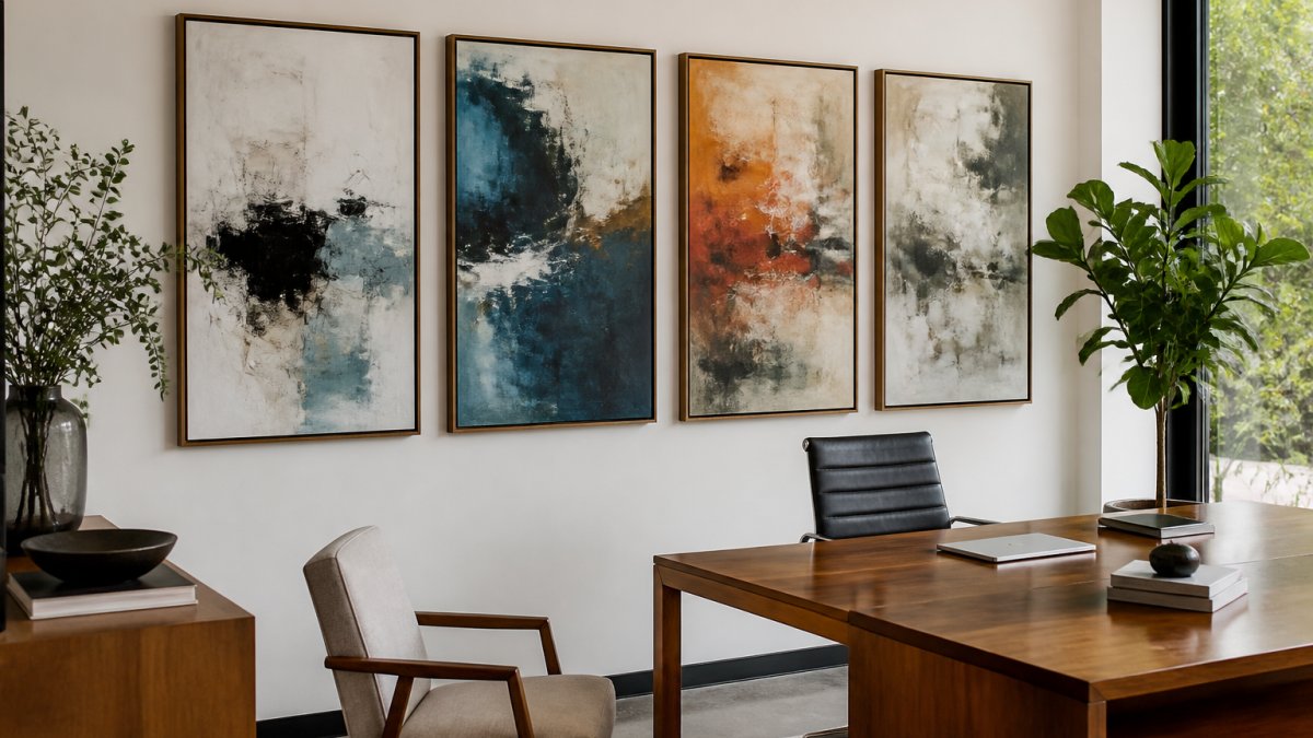
- On a long blank wall: one statement canvas generally reads better than three small frames. If you go with a gallery wall, keep the group's total width within the two-thirds rule and align the group's center to the furniture centerline.
Viewing distance matters as much as size. A useful guide is that the diagonal of the artwork should be roughly one-half to one times the distance from the main viewing point. In practice, a piece viewed from 6 to 8 feet away, typical for a private office or reception seating, can carry more detail than one viewed from 15 feet down a corridor, which needs bolder shapes and higher contrast to register.
A few practical guidelines we give clients:
- Measure the wall and the furniture first, then shop to those numbers rather than the other way around.
- Leave at least 6 inches of clearance on each side and 8 to 10 inches above furniture backs.
- Hang a single statement piece rather than three small ones on a long wall.
- Keep the bottom edge above the backs of chairs and clear of swing paths in high-traffic areas.
- Account for frame width: a 2-inch frame adds 4 inches to the overall width and height.
How to Choose Office Wall Art: A Practical Decision Framework
How to choose office wall art comes down to four questions, answered in order. Work through them before you browse, and the shortlist gets short fast.
- What happens in this room? Focused work favors geometric or minimal pieces; creative work favors expressive ones.
- Who sees it? Client-facing rooms call for calm palettes; internal team spaces can carry bolder color.
- What is the wall size? One large piece beats a cluster of small ones on a wide wall.
- What is the light like? Bright rooms handle deep color; dim rooms need lighter, warmer tones.
If two options tie, pick the one that makes you pause. That reaction tends to hold up over years, not weeks.
Color, Mood, and Productivity: What the Evidence Says
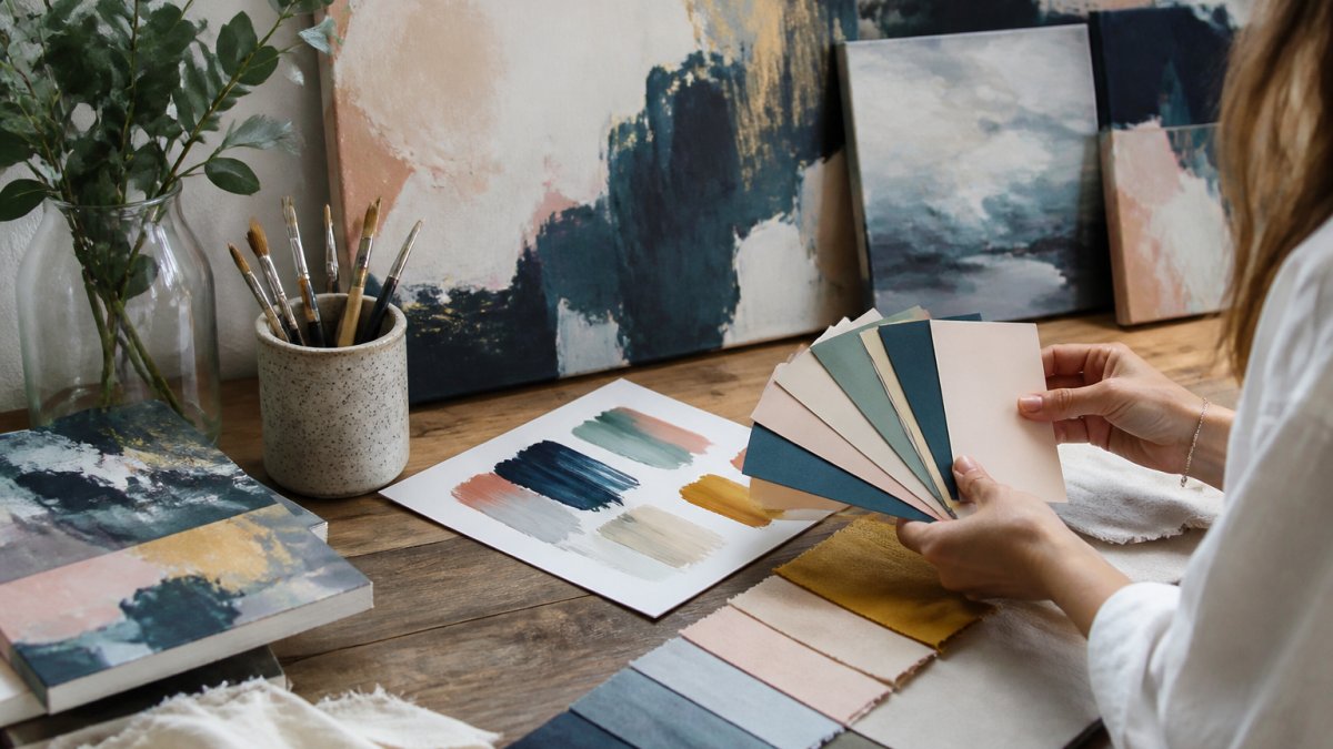
Color affects mood, but the honest answer is that research on color and productivity is mixed and often overstated. Blues and greens are widely described as calming, while warm earth tones feel grounding. Treat those as reasonable design instincts, not guarantees of output. The mechanism is indirect: color influences perceived pleasantness and arousal, and a workspace people find pleasant tends to get used more. That is a design argument, not a productivity claim.
A practical way to separate guidance from evidence:
- Well-supported as design guidance: contrast, glare control, and visual clutter affect comfort and legibility during long workdays. These are measurable and worth acting on.
- Reasonable but not proven: specific hues improving focus or creativity. Use them as starting points, then test in your own space.
- Overstated: claims that a single color reliably raises output. Skip those.
Visual comfort deserves more attention than color lore. Glare from glass, glossy frames, or a bright window behind the art can wash out a piece and distract from screens. Matte canvas and anti-reflective glazing reduce glare under overhead lighting. High-contrast, busy compositions placed directly in a sightline can compete with monitors and documents; lower-contrast, larger shapes read more calmly at desk distance. For sensory-sensitive workers, keep the most visually active pieces out of primary sightlines and reserve them for reception or circulation areas.
A simple palette framework for offices:
- Focus-heavy rooms: cooler neutrals, muted blues and greens, and low-contrast compositions.
- Collaborative and creative spaces: warmer accents, bolder contrast, and larger gestures.
- Client-facing rooms: restrained palettes with one accent color tied to brand or furnishings.
What we can say with confidence: a workspace people find pleasant gets used more. Choose a palette you can live with daily, and let the art carry the emotional weight. Original work from a gallery like Susan Fielder Art brings a story with it, and a piece with meaning tends to stay on the wall longer than a trend-driven print.
Conclusion
Picking art for a workspace stalls most people because the options are endless and the stakes feel personal. Start with the room's function, size the piece to the furniture, and choose a palette you will still like in a year.
At Susan Fielder Art, every piece is an original abstract painting, and 10% of all proceeds go to pancreatic cancer research through the iPlaid series. Our site is verified secure with safe checkout, and we are registered with the Art Storefronts Organization. Shop now and give your office walls something worth looking up at.
Frequently Asked Questions
What type of abstract art is best for an office?
The best type depends on the office function. Geometric abstraction and minimalism suit spaces that need calm and order, while abstract expressionism adds energy to creative areas. For a professional office, neutral or muted palettes in a large abstract art for office walls often work best because they feel cohesive and not distracting. Consider the room's lighting and existing décor before deciding.
What colors are best for office wall art?
Blues, greys, and teals are calming and support focus, while earthy tones like beige and terracotta create warmth. Vibrant colors can boost energy but may overwhelm small spaces. For a home office, a balanced palette with one accent color often works well. The 2026 trend toward neutral black and beige abstract art reflects a desire for versatile, professional pieces that fit various décors.
How do you choose art for an office space?
Start by measuring your wall and choosing a piece that fills 60-75% of the available width above furniture. Match the style to the office's purpose: minimalism for focused work, geometric for structure, expressive for creativity. Consider the frame and material durability, and pick colors that complement existing furniture. For guidance on how to choose office wall art, use our decision framework above.
Can abstract art help create a more focused workspace?
Yes, when chosen carefully. Calming colors and minimalist compositions reduce visual clutter, which can support concentration. However, highly vibrant or complex pieces may distract in task-heavy areas. Place quieter abstract art in zones where deep work happens, and reserve energetic pieces for break areas. The evidence on productivity is limited, but many people report that a well-styled workspace feels more engaging.
Ready to bring real energy to your workspace? Browse the collection at Susan Fielder Art and find the original piece that fits your room, your work, and a cause that matters.