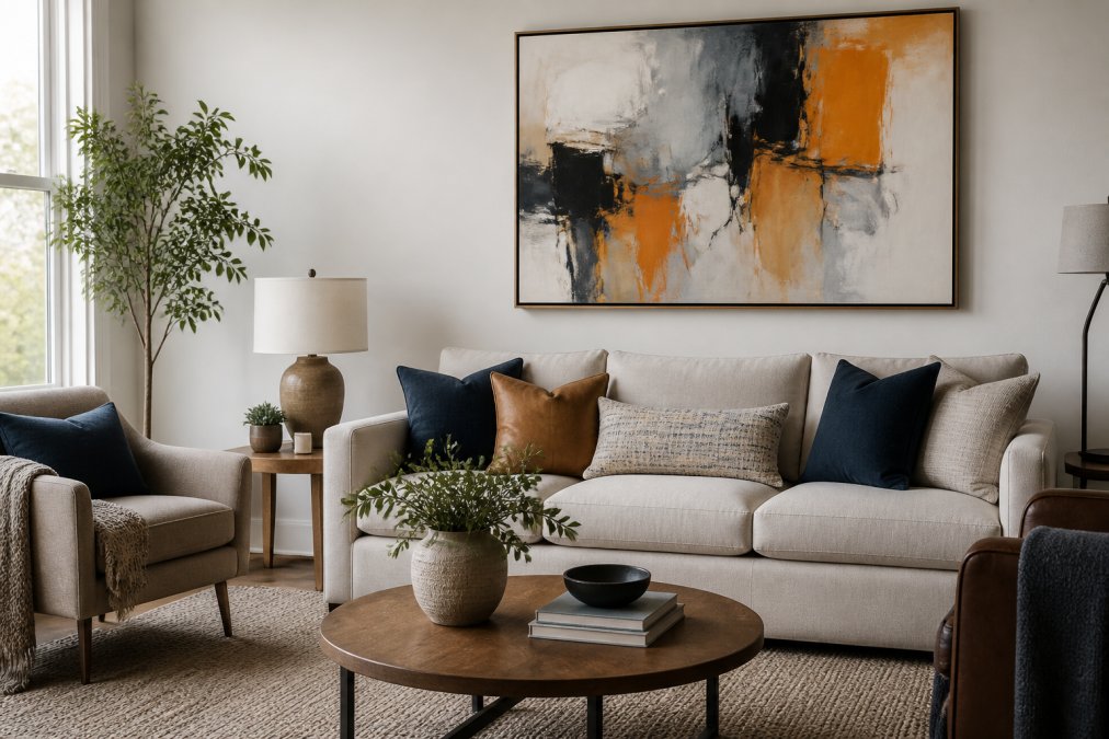
 how-to
How to Match Abstract Art with Furniture: 2026 Guide
Table of Contents
- Why Abstract Art Works with Nearly Any Furniture Style
- Abstract Art Color Palette Coordination: Pull, Don't Match
- Balancing Scale, Proportion, and Visual Weight
- How to Hang Art Above a Sofa Without Guessing
- Using Texture and Negative Space to Create Harmony
- Lighting, Frames, and Digital Tools: What Most Guides Skip
- Common Mistakes When Pairing Abstract Art with Furniture
- Conclusion
- Frequently Asked Questions
Last Updated: September 18, 2026
Why Abstract Art Works with Nearly Any Furniture Style
The abstract wall art segment holds a 30.49% share of the broader wall art market in 2026, according to Fortune Business Insights' wall art market analysis, and the reason is simple: abstract pieces adapt to almost any interior. A single painting can sit above a mid-century credenza or a traditional roll-arm sofa and look intentional in both rooms.
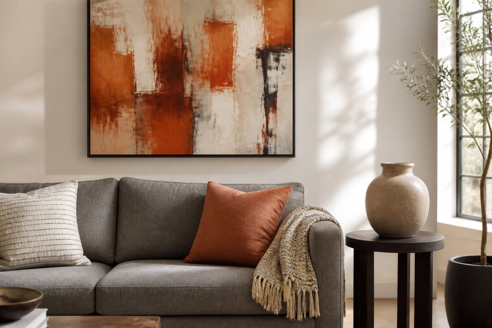
The 2026 Market Shift Toward Abstract Wall Art
Buyers are moving away from art that "matches the couch" and toward art that sets the room's mood. Industry guidance for 2026 now recommends a three-step method that starts with defining the room's feeling, not the furniture's color (Modern Wall Art Co's 2026 abstract art style guide).
Abstract Art Color Palette Coordination: Pull, Don't Match
Abstract art color palette coordination means pulling one or two colors already present in your room and echoing them in the artwork, rather than hunting for a piece that copies your upholstery exactly. Designers recommend pulling specific colors from existing furniture, rugs, or accent pillows to select abstract art that echoes those hues (Artwork Archive's guide to selecting art).
Here's the practical version:
- Look at your rug, throw pillows, or a favorite chair
- Pick one dominant color and one accent color
- Choose art that includes those hues somewhere in its composition
- Let the rest of the painting introduce something new
The 70/30 Color Rule for Art and Upholstery
A simple guideline many designers use: let roughly 70% of the artwork's palette relate to your existing room colors, and reserve about 30% for something fresh, that new 30% keeps a room from looking flat.
Monochromatic vs. Complementary Approaches
Two approaches cover most rooms. A monochromatic scheme uses variations of one hue, which reads calm and cohesive. A complementary scheme pairs opposite colors on the color wheel, like blue and orange, which reads energetic. A bedroom usually wants the first, a creative studio or entryway the second.
Balancing Scale, Proportion, and Visual Weight
Scale and proportion decide whether art looks intentional or accidental. A common rule: art hung above a sofa should span about two-thirds to three-quarters of the sofa's width. Too small, and the piece floats. Too large, and it crowds the wall.
Visual Weight: The Variable That Overrides the Rule
Visual weight is how heavy a piece feels to the eye, independent of its physical dimensions. A dark, heavily textured painting feels heavier than a pale, airy one, so it needs more empty wall to breathe, a 30-inch canvas in deep charcoal and rust can visually outweigh a 48-inch canvas in pale cream and blush.
A practical way to read visual weight:
- Darker values add weight. A painting with a dominant dark field reads heavier than one with a dominant light field.
- Saturated color adds weight. A small block of pure cadmium red pulls the eye harder than a large field of muted sage.
- Texture and impasto add weight. Visible brushwork or palette-knife ridges cast micro-shadows that make the surface feel denser.
- High contrast adds weight. Strong light-to-dark transitions read heavier than low-contrast, tonal compositions.
Shape Language: Geometric vs. Organic
The shapes inside an abstract piece interact with the shapes of your furniture, the psychological layer most guides skip.
-
Geometric abstracts (hard edges, circles, grids, angular blocks) echo the geometry of modern and mid-century furniture. A grid-based painting above a squared-off credenza reinforces the room's order. Above a curved, rolled-arm sofa, the same painting creates deliberate tension.
-
Organic abstracts (soft blobs, flowing lines, irregular washes) echo curved upholstery, round tables, and arched mirrors. Above a boxy sectional, organic forms soften the room's hard lines.
Matching Scale to Specific Furniture Silhouettes
Different furniture types demand different art proportions. A few patterns that hold up in practice:
- Low, long sofas and sectionals: art should be wide and relatively shallow. A panoramic or landscape-oriented piece at 60-75% of the sofa's width keeps the horizontal line intact. A tall, narrow piece above a long sofa looks like a postage stamp.
- Tall wingback chairs or high-back settees: a vertical or square piece balances the height. A wide horizontal piece above a tall chair can make the chair feel top-heavy.
- Console tables and credenzas: art should be roughly the same width as the console, or slightly narrower. Because the console is shallow, a deep, heavily textured piece can visually tip forward.
- Dining room sideboards: art centered above the sideboard at 50-70% of its width, with the bottom edge 6-10 inches above the surface, keeps the arrangement grounded.
The Tape Trick: Test Before You Commit
Professional design frameworks for 2026 suggest using removable tape to mark proposed artwork dimensions against the furniture's footprint before buying (Musa Art Gallery's 2026 home decor statistics). It costs nothing and prevents the most expensive mistake in art buying.
A Quick Sanity Check Before You Buy
Before you commit, run this three-question check:
- Does the piece cover 60-75% of the furniture's width, or is it intentionally scaled as a small statement piece?
- Does its visual weight match the breathing room around it?
- Does its shape language reinforce or deliberately contrast the furniture's silhouette?
If all three answers are intentional, the piece reads as designed rather than accidental.
How to Hang Art Above a Sofa Without Guessing
The best height for art above a sofa is 15-25 cm (6-10 inches) above the sofa back, or centered at roughly 145 cm (57 inches) from the floor, near eye level for most adults.
Here's the full method:
- Mark the sofa's centerline with a pencil
- Tape the artwork's outline at your chosen height
- Check the spacing from the sofa back
- Mark the hanging point on the wall
- Install the hook, then hang and step back
Using Texture and Negative Space to Create Harmony
Texture is what separates a room that looks styled from one that looks assembled. Selecting artwork that matches a room's palette while intentionally varying in texture and depth is a primary method for creating a harmonious atmosphere (Gregg Irby Gallery's art selection guidance).
- Smooth furniture pairs well with textured art
- Patterned upholstery pairs well with simpler compositions
- Leave breathing room on both sides of a solo piece
Lighting, Frames, and Digital Tools: What Most Guides Skip
Most guides stop at color and size. The details that actually decide whether a piece works are lighting, framing, and testing the art in your own space before it ships.
Lighting: The Variable That Rewrites Your Color Match
Lighting changes everything: a painting lit by a warm bulb looks different than one near a north-facing window. Deep-toned abstracts need more light to read well, while pale pieces can wash out in direct sun.
- Color temperature. Warm light (roughly 2700K-3000K, typical of incandescent and warm-white LEDs) pushes reds, oranges, and yellows forward and mutes blues and greens. Cool light (roughly 4000K-5000K, typical of daylight-balanced LEDs and north-facing windows) does the opposite. If your room is lit warm and your painting's dominant hue is blue, the blue will read grayer than it did in the gallery.
- Direction. Ambient ceiling light flattens texture. Directional light, a picture light, a track head, or a nearby floor lamp, rakes across the surface and reveals brushwork, impasto, and canvas weave. If you bought the piece for its texture, ambient-only lighting will hide the reason you bought it.
- Intensity. A common pattern is that dark, saturated abstracts need roughly 2-3x the light of pale, high-key pieces to read at the same apparent brightness. If you cannot add light, choose a lighter piece for a dim room.
- Glare. Glass-framed art under a direct downlight or opposite a bright window will throw glare that erases the image from most viewing angles. Textured originals on canvas, unframed or float-mounted, sidestep this entirely.
Frame Selection: Match the Room, Not the Painting
For frame selection, match the frame to the room's existing metals and wood tones, not to the painting alone. A thin black frame reads modern. A natural oak frame softens a bold piece.
A few trade-offs worth knowing:
- Thin metal frames (black, brass, or brushed nickel) disappear visually and let the art carry the room. They work best when the room already has metal accents in the same finish.
- Natural wood frames (oak, walnut, ash) warm up cool-toned abstracts and tie the piece to wood furniture in the room. Match the wood tone to the dominant wood in the space, not to a secondary piece.
- Float frames show the canvas edge and add a thin shadow line around the piece, which reads as depth. They work well for stretched canvases and are usually the least expensive custom option.
- No frame at all is a legitimate choice for gallery-wrapped canvases. It reads contemporary and removes one more color decision from the room.
Digital Visualization: Preview Before You Buy
For digital visualization, many galleries now offer room-preview tools: upload a photo of your wall, drop the painting in, and see it scaled to your actual furniture, the closest thing to a home trial.
- They do well: scale and placement. You can see instantly whether a piece is too small for the wall or too tall for the sofa.
- They do poorly: color accuracy. Screens vary, and a phone photo of your wall carries its own white-balance errors. Treat the preview as a scale check, not a color check.
- Augmented reality apps (the kind that let you point your phone at a wall and place a virtual frame) are useful for the same reason, they confirm scale in the actual room, in real light, before you commit.
DIY Framing and Digital Visualization on a Budget
Framing doesn't have to be expensive. Canvas prints and stretched originals often look best unframed or in a simple float frame.
- Use ready-made frames in standard sizes (8x10, 11x14, 16x20, 18x24, 24x36 inches), which cost a fraction of custom and fit most abstract pieces.
- Choose a float mount to show the canvas edge; it reads as intentional and hides minor size mismatches.
- Skip glass for textured originals, it flattens texture and adds glare.
- Use a free room-preview tool before you buy to prevent the most common sizing mistake.
Common Mistakes When Pairing Abstract Art with Furniture
The biggest mistake is treating art as an afterthought. Buyers who pick furniture first, then scramble for art, usually end up with the wrong size or mood.
Other frequent errors:
- Matching art exactly to upholstery, which looks flat
- Hanging too high above the sofa
- Choosing art that's too small for the wall
- Ignoring how the room's lighting hits the piece
- Buying before testing the size with tape
Fix these five, and most rooms come together quickly.
Conclusion
Matching abstract art to furniture isn't about finding a perfect color replica. It's about pulling tones, testing scale, and letting texture and light do the rest. Get those right, and any abstract piece can anchor a room.
Frequently Asked Questions
Does wall art have to match furniture colors?
No. Matching creates cohesion, but contrast works just as well when art and furniture share subtle connections in tone, texture, or feeling. Designers recommend pulling one or two specific colors from existing upholstery, rugs, or pillows so the abstract art echoes those hues rather than replicating them. The goal is a conversation between pieces, not a copy. A bold abstract in a neutral room can become the focal point without matching anything at all.
What is the 70/30 rule in art and interior design?
The 70/30 rule splits a room's visual weight: roughly 70% dominant color or tone and 30% accent. In practice, if your sofa, rug, and walls sit in a dominant neutral, let your abstract art carry the 30% accent color. This keeps the room from feeling flat while preventing the art from competing with upholstery. Apply the same logic to pattern and texture for a cohesive result.
Should abstract art be the same width as the sofa?
Not the same width, but roughly two-thirds. A common guideline is that art or a gallery wall should span about 60% to 75% of the sofa's width to feel anchored rather than floating. For a standard three-seat sofa, that means an arrangement around 1.5 to 1.8 meters wide. If your piece is smaller, group it with others or add negative space on both sides for balance.
How do I know an online abstract painting will look good in my space?
Use the tape trick before buying. Mark the proposed dimensions on your wall with removable tape, then photograph the wall from seated eye level. Many galleries offer detailed photos and scale references. Check the return policy and condition guarantees before purchasing. Comparing the artwork's color palette to your upholstery in natural light reduces the risk of a mismatch.