 blog
blog
Abstract Art Color Palettes for Modern Interiors
Table of Contents
- Understanding Color Theory for Abstract Art
- Abstract Art Color Combinations That Work
- How to Match Abstract Art with Home Décor
- Abstract Art for Neutral Interiors
- Modern Interior Color Palettes and Composition Balance
- Choosing Scale, Placement, and Color Intensity
- Room-Specific Palette Recommendations
- Transforming Your Space with Abstract Art Color Palettes
- Frequently Asked Questions
Last Updated: October 6, 2026
Understanding Color Theory for Abstract Art
Color theory forms the foundation for choosing abstract art that transforms your space.
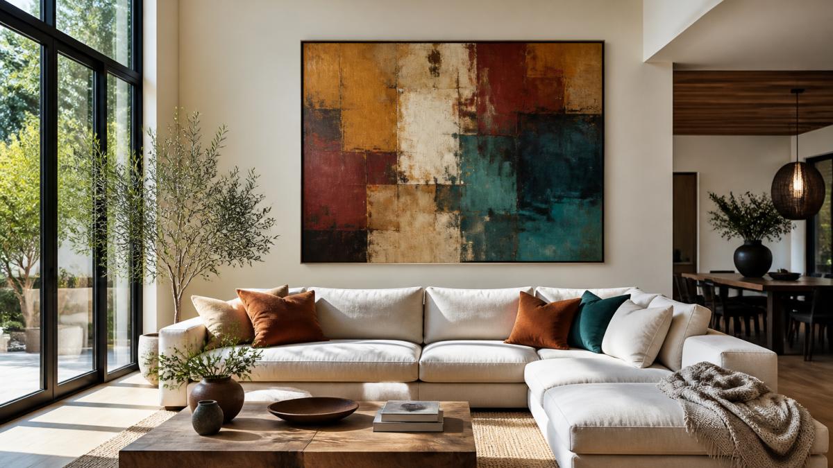
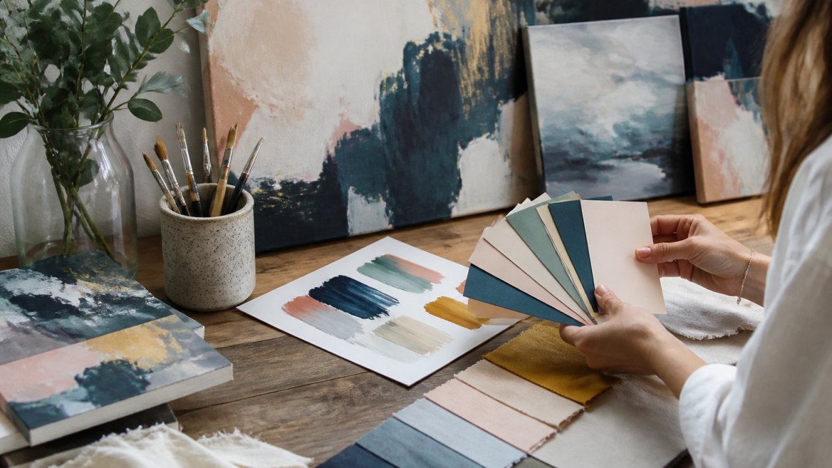
The color spectrum works in predictable ways. Warm tones (reds, oranges, yellows) feel energetic and inviting. Cool tones (blues, greens, purples) feel calm and grounding.
Complementary colors sit opposite each other on the color wheel. They create visual tension and excitement when paired together. Analogous colors sit next to each other and feel harmonious and restful.
Key color relationships for abstract art:
- Warm and cool contrast creates movement and depth
- Monochromatic schemes (one color in different shades) feel sophisticated
- Split-complementary schemes (a color plus two neighbors of its opposite) offer balance
- Triadic schemes (three colors equally spaced) feel vibrant and playful
When you understand these basics, selecting abstract art becomes intentional rather than random.
Abstract Art Color Combinations That Work
Real color combinations create the foundation for successful interior design. The abstract art color palettes that perform best in modern homes fall into three distinct families, each with its own emotional impact.
Warm Earth Tones and Deep Neutrals
Warm earth tones anchor a space with natural, grounding energy. These palettes include trending interior color combinations like warm caramel, soft taupe, and rich chocolate browns paired with cream and ivory.
These combinations work because they feel familiar and safe. Earth tones reference natural materials, clay, wood, stone, soil. Your eye trusts them immediately.
Warm neutral palettes to consider:
- Caramel, cream, and soft white with burnt sienna accents
- Taupe, beige, and warm gray with touches of terracotta
- Warm brown, ivory, and soft gold with rust highlights
- Chocolate, sand, and pale cream with bronze metallic details
These palettes pair beautifully with natural wood finishes, linen textures, and soft lighting. They work in living rooms, bedrooms, and home offices because they never feel jarring. The abstract art becomes a focal point without overwhelming the space.
Bold Jewel Tones and Rich Accents
Jewel tones bring drama and sophistication to modern interiors. According to 2026 interior design color trends, emerging palettes include merlot red, oxblood, plum, and deep teal combined with navy, charcoal, and black.
These colors feel luxurious and intentional. They're not timid. When you choose abstract art with jewel tones, you're making a statement about your space and your taste.
Rich jewel tone combinations:
- Deep teal, navy, and black with gold metallic accents
- Plum, burgundy, and charcoal with silver highlights
- Oxblood, deep green, and cream with copper details
- Merlot, navy, and white with bronze touches
Jewel tones work best in spaces with good natural or artificial lighting. They need brightness to shine. In darker rooms, they can feel heavy.
Black-and-White with Metallic Touches
Black-and-white abstract art creates clean, timeless contrast. This palette works in virtually any modern interior because it's fundamentally about composition and movement rather than color emotion.
Metallic accents, gold, silver, copper, or bronze, add warmth and sophistication to black-and-white combinations. They catch light and create visual interest without introducing new colors.
Black-and-white palette variations:
- Pure black, white, and soft gray with warm gold accents
- Black, cream, and charcoal with cool silver details
- Deep black, ivory, and light gray with rose gold touches
- Charcoal, white, and pale gray with bronze highlights
Black-and-white abstract art pairs beautifully with minimalist interiors, Scandinavian design, and contemporary spaces. The metallic touches prevent the palette from feeling cold or sterile.
How to Match Abstract Art with Home Décor
Matching abstract art with your existing décor requires a simple decision framework.
Your abstract art should either echo those colors or provide intentional contrast. Echoing creates harmony and feels restful.
Three matching strategies:
1. Monochromatic matching, Your abstract art uses one color family that matches your existing palette.
2. Complementary contrast, Your abstract art uses colors opposite to your existing palette.
3. Neutral bridge, Your abstract art is primarily neutral (black, white, gray) with accent colors that tie to your décor.
When you're uncertain, choose a piece with at least one color that already exists in your room.
Abstract Art for Neutral Interiors
Neutral interiors, dominated by whites, grays, beiges, and blacks, need abstract art to bring warmth and personality. Without it, the space feels sterile and cold.
In neutral rooms, abstract art becomes the primary color statement. It carries the emotional weight of the entire space.
Bold abstract art works best in neutral spaces. Muted or subtle pieces disappear against neutral walls.
Warm earth tones feel especially powerful in neutral interiors.
Jewel tones also perform beautifully in neutral spaces. Deep teal or plum abstract art against white walls creates a gallery-like sophistication without overwhelming the room.
Modern Interior Color Palettes and Composition Balance
Composition balance determines whether abstract art feels harmonious or chaotic in your space. Balance isn't about symmetry, it's about visual weight distribution.
Modern interiors favor asymmetrical balance. Your abstract art doesn't need to be centered or symmetrical. In fact, off-center placement often feels more dynamic and contemporary.
Color balance within the artwork matters more than placement.
Composition principles for modern spaces:
- Asymmetrical placement creates movement and energy
- Negative space (empty wall around the artwork) provides breathing room
- Color distribution should feel intentional, not accidental
- Scale matters, the artwork should command attention without overwhelming the wall
When abstract art feels balanced, it settles into your space naturally. It doesn't fight with your furniture or create visual tension. It enhances the room's existing composition.
Choosing Scale, Placement, and Color Intensity
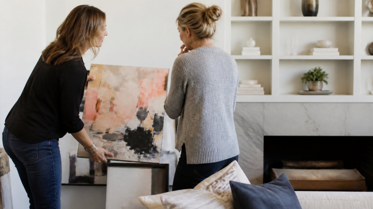
Scale is one of the most overlooked decisions when selecting abstract art. A small painting on a large wall feels lost. An oversized painting in a small room feels aggressive.
Scale guidelines:
- Above a sofa: artwork should be two-thirds the width of the furniture
- On a feature wall: artwork can be larger, occupying 40-60% of wall space
- In corners: smaller pieces (24-36 inches) work better than large ones
- Above console tables: keep artwork 12-18 inches above the furniture
Placement height matters too. The center of your artwork should sit at eye level when you're standing in the room, approximately 57-60 inches from the floor.
Color intensity determines how much visual attention the artwork demands. High-intensity colors (bright, saturated, bold) draw the eye immediately. Low-intensity colors (muted, soft, subtle) feel calming.
Match color intensity to your room's energy level. A busy, active space can handle high-intensity abstract art. A calm, restful bedroom benefits from lower-intensity colors and softer compositions.
Room-Specific Palette Recommendations
Different rooms need different color approaches. The abstract art color palettes that work in a living room might feel wrong in a bedroom.
Living Rooms and Open Spaces
Living rooms are social spaces where people gather. They benefit from abstract art with warm tones and energetic composition. This encourages conversation and creates an inviting atmosphere.
Warm earth tones paired with jewel tone accents work beautifully here. A caramel, rust, and deep teal abstract painting creates visual interest without feeling aggressive.
Black-and-white abstract art also performs well in living rooms, especially when metallic accents catch light and create visual movement. These pieces feel contemporary and gallery-like.
Best living room palettes:
- Warm caramel, cream, and rust with deep teal accents
- Charcoal, white, and soft gray with warm gold metallic details
- Merlot, navy, and cream with bronze highlights
- Warm brown, taupe, and soft white with copper accents
Open-concept spaces benefit from abstract art that bridges multiple color zones.
Bedrooms and Private Retreats
Bedrooms need calm, restful abstract art. This is where color intensity matters most. Lower-intensity colors promote better sleep and create sanctuary-like spaces.
Soft earth tones work beautifully in bedrooms. Pale taupe, warm cream, and soft sand create a cocoon-like feeling.
Avoid high-intensity jewel tones in bedrooms unless they're balanced with significant neutral space. A small accent of deep teal is fine.
Best bedroom palettes:
- Soft taupe, cream, and pale gray with subtle warm accents
- Pale sand, ivory, and warm white with touches of soft green
- Light gray, cream, and white with muted blue-gray tones
- Warm beige, soft white, and pale brown with gentle color transitions
Black-and-white abstract art works well in bedrooms when the composition feels peaceful rather than chaotic. Look for pieces with gentle curves, soft transitions, and balanced composition.
Home Offices and Creative Spaces
Home offices need abstract art that inspires focus without creating distraction. This is where moderate color intensity works best, enough to feel energizing, not so much that it overwhelms concentration.
Warm neutrals with subtle color accents support productivity. A caramel and cream abstract painting with touches of soft green creates an environment where thinking feels clear and creative.
Jewel tones can work in home offices if they're balanced with plenty of neutral space.
Best home office palettes:
- Warm caramel, cream, and soft white with touches of sage green
- Navy, cream, and light gray with warm gold metallic details
- Charcoal, white, and soft gray with subtle blue-gray tones
- Warm brown, taupe, and ivory with touches of muted teal
Consider your office lighting when selecting color intensity. Rooms with natural light can handle slightly more saturated colors.
Transforming Your Space with Abstract Art Color Palettes
Choosing the right abstract art color palette transforms how your space feels. The artwork becomes more than decoration, it becomes the emotional center of the room.
Start with your existing colors and ask: Do I want harmony or contrast? This single question guides every other decision. Harmony creates calm. Contrast creates energy.
Susan Fielder Art offers emotionally charged abstract paintings that bring vibrant energy to any space.
The abstract art color palettes that work best are the ones that feel intentional.
Transforming your home with the right abstract art starts with understanding your color needs. Discover how abstract art color palettes can completely change the way your space feels, browse original abstract artwork that transforms interiors.
Frequently Asked Questions
How do I choose abstract art color palettes that will work in my home?
Start by identifying your room's existing color scheme, lighting, and mood. Pull colors from your walls, furniture, and finishes, then select abstract art that either complements those tones or provides intentional contrast. Consider whether you want the artwork to blend seamlessly or serve as a bold focal point. Warm earth tones, navy, sage green, and black-and-white palettes work well in modern interiors, while richer jewel tones like merlot, plum, and deep teal create dramatic impact. Test how the colors appear in your space's natural and artificial light before committing.
Should abstract art match or contrast with my room's color scheme?
Both approaches work, it depends on your design intent. Matching creates visual harmony and a cohesive, calm environment, ideal for bedrooms and minimalist spaces. Contrasting makes the artwork a statement piece that draws the eye and energizes the room, perfect for living areas and home offices. A middle ground is using accent colors from your palette in the abstract art while introducing one new, complementary tone. This gives you intentional contrast without clashing. Neutral interiors offer the most flexibility; abstract art can introduce any color palette you desire.
What abstract art color combinations work best for neutral walls?
Neutral walls are a blank canvas for bold abstract art. Rich neutrals like caramel, taupe, and warm browns create sophisticated depth, while jewel tones such as deep teal, oxblood, and plum add drama and movement. Black-and-white abstract paintings with metallic accents provide clean, contemporary contrast. Soft pastels, blush pink, and lavender offer subtlety if you prefer understated elegance. The key is choosing combinations with strong compositional balance and color contrast, the artwork's internal color relationships matter more than matching your walls. This freedom makes neutral interiors ideal for displaying emotionally expressive abstract pieces.
How do I avoid overwhelming a room with a bold abstract painting?
Control three variables: scale, placement, and surrounding visual weight. A large, intensely colored piece works best as the sole focal point in a room with minimal competing patterns and furnishings. Place it where it commands attention without dominating, above a sofa, on a feature wall, or as an entry statement. Balance bold colors with neutral furniture and clean lines to let the artwork breathe. If your room already has pattern, texture, or color complexity, choose an abstract piece with softer color intensity or smaller dimensions. Lighting matters too; warm, focused light enhances impact without making the space feel cramped.