 listicle
Best Color Palettes for Abstract Paintings in 2026
Table of Contents
- Why Color Matters in Abstract Paintings
- Warm Earth Tones: The Dominant Palette for 2026
- Navy, Smoky Blue, and Deep Blue Abstracts
- Black and White: The Most Versatile Combination
- How to Choose Colors for Abstract Art
- Emerging Trends: Muted Jewel Tones and Sophisticated Contrasts
- Digital Tools to Build Your Perfect Palette
- Frequently Asked Questions
Last Updated: August 26, 2026
Why Color Matters in Abstract Paintings
Color is the keyboard, the eyes are the harmonies, the soul is the piano with many strings, and when it comes to the best color palettes for abstract paintings, this truth becomes impossible to ignore. At Susan Fielder Art, color doesn't just decorate an abstract work; it defines its emotional core. According to research from CentER at Tilburg University, blue and red abstract works sold for prices 10.6% higher at auction, suggesting that color choice directly impacts both artistic impact and market value.
The relationship between color and perception runs deeper than aesthetics. A study from HSE University and partner institutions analyzing thousands of canvases found that buyers place consistently higher value on blue and favor bright, saturated palettes. What matters most isn't complexity or adherence to traditional color theory, it's visual diversity achieved through vibrant, saturated colors and clearly defined color segments.
This matters because choosing the right palette determines whether your abstract painting feels cohesive or chaotic, energizing or calming, timeless or trendy. Below, we'll walk you through the color palettes that define 2026's abstract art landscape, why they work, and how to apply them to your own work.
Warm Earth Tones: The Dominant Palette for 2026
Warm earth tones have emerged as the dominant category for abstract art in 2026, driven by a broader shift in residential design toward warmer, more organic palettes. According to Best Colors for Abstract Art in Modern Homes, the most sought-after earth tones include creamy beige, warm sand, dusty blush, muted gold, sage olive, and terracotta.
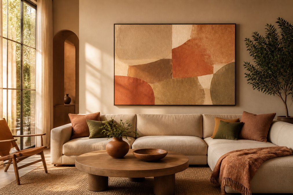
Why this shift? Cool grey minimalism, which dominated for years, feels dated now. Collectors and homeowners are moving toward palettes that feel grounded and alive. These warm earth tones work across multiple interior styles and don't compete aggressively with existing furnishings, they complement them.
The practical advantage of earth tones lies in their versatility. A painting dominated by sage olive and terracotta works equally well in a Scandinavian living room, a bohemian bedroom, or a contemporary office. The tones feel natural without being predictable. They also age well; trends shift, but warm neutrals remain relevant.
When working with earth tones, saturation matters. A muted gold feels sophisticated; a bright, neon-adjacent gold feels dated. The best earth-tone abstract paintings use tint and shade variation to create depth without relying on high-saturation contrasts. Think of how a single terracotta base becomes more interesting when you layer in dusty blush, warm sand, and subtle charcoal accents.
| Warm Earth Tone | Best Paired With | Ideal Room Type |
|---|---|---|
| Terracotta | Sage olive, cream, charcoal | Living rooms, bedrooms |
| Dusty blush | Warm sand, gold, white | Bedrooms, offices |
| Sage olive | Terracotta, beige, navy | Dining rooms, living rooms |
| Muted gold | Cream, warm grey, deep brown | Entryways, accent walls |
Navy, Smoky Blue, and Deep Blue Abstracts
Blue remains the only color that consistently correlates with higher artwork prices across the market. Navy and smoky blue are particularly strong in 2026, creating a sense of calm while reading as reliably sophisticated. Deep blue works in dining rooms, bedrooms, and contemporary living spaces where it anchors the room without overwhelming it.
The psychology here is straightforward: blue evokes trust, tranquility, and depth. In abstract work, it creates visual weight without aggression. A painting dominated by navy with bright yellow accents reads as energetic and balanced. The same yellow with a muted blue background feels more contemplative.
What distinguishes strong blue abstracts from mediocre ones? Contrast. A pure navy field with no variation feels flat. Introduce smoky blue, add white highlights, layer in subtle grey tones, and suddenly the painting has dimension. The color harmony comes from using analogous blues, navy, smoky blue, and slate, rather than jumping to unrelated hues.
Deep blue also pairs exceptionally well with warm accents. A predominantly blue composition with touches of terracotta or gold creates visual tension that draws the eye. This is where understanding color temperature matters: cool blue against warm orange or gold creates the kind of contrast that makes abstract paintings memorable.
Black and White: The Most Versatile Combination
Black and white is the most versatile abstract art color palette, working across more interior styles, room types, and surrounding palettes than any specific color direction. High-contrast black-and-white pieces create energy and visual tension, suiting modern, industrial, and contemporary spaces equally well.
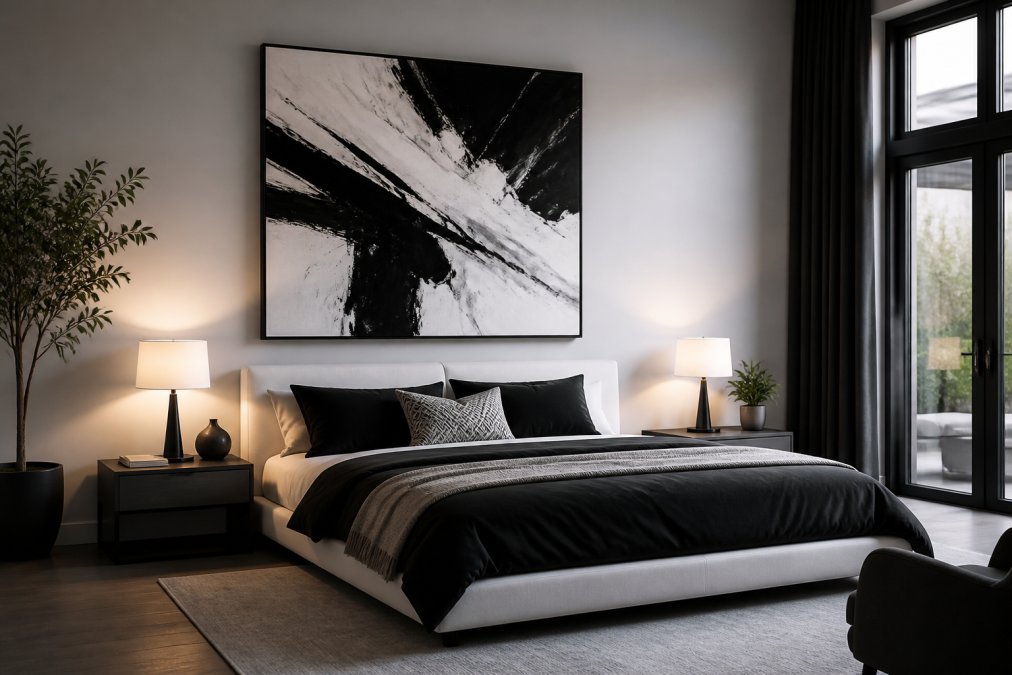
The advantage of black and white goes beyond aesthetics. These paintings don't compete with existing color schemes. Whether your sofa is grey, your walls are cream, or your accents are jewel tones, a black-and-white abstract integrates seamlessly. It reads as sophisticated and timeless because it isn't chasing a trend.
From a technical standpoint, black and white abstracts rely entirely on value, the range from dark to light. Without color to carry the composition, every brushstroke, every shape, every transition matters. The best black-and-white pieces use opacity and transparency strategically. A transparent white wash over black creates grey; layering builds complexity. This is where impasto and glazing techniques shine: the physical texture of the paint becomes part of the visual story.
Black and white also work exceptionally well for artists exploring emotional expression. Without the distraction of color, the viewer focuses on form, line, and movement. Agnes Martin's minimalist abstracts prove this point: her neutral palettes emphasize subtlety and allow the artwork to blend seamlessly with varied interior design styles.
How to Choose Colors for Abstract Art
Selecting the right palette for your abstract work requires balancing personal expression with market awareness. Here's the decision framework:
Start with emotional intent. What feeling should the painting evoke? Calm and introspective suggests muted tones, analogous colors, and limited saturation. Energetic and dynamic calls for saturated hues, high contrast, and complementary color relationships.
Consider your space. Are you painting for a specific room? A gallery? A collector you haven't met? If the work is destined for a particular environment, sketch the palette against that setting. Warm earth tones work everywhere; electric neon does not.
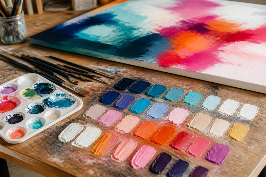
Audit your pigments. Not all reds are created equal. A cadmium red behaves differently than alizarin crimson. Understanding your actual paint colors, their undertones, their mixing behavior, their permanence, matters more than theory. A limited palette of high-quality pigments beats a large palette of mediocre ones.
Test before committing. Create small studies with your proposed palette. See how the colors interact on canvas, not just in your mind. Watercolor swatches or acrylic test panels take 20 minutes and save hours of regret.
Understanding Color Theory for Abstract Painters
Color theory provides the grammar for visual communication. The color wheel shows relationships: complementary colors sit opposite each other (blue and orange, red and green, yellow and purple). Analogous colors sit adjacent (blue, blue-green, green). Triadic palettes use three colors equally spaced around the wheel.
But here's what most guides miss: color harmony contributes to explaining market price, but contrast metrics in hue and saturation correlate with outcomes more strongly than simple color-complexity counts. In other words, what sells isn't adherence to color theory rules, it's visual diversity and bold choices.
Saturation matters more than hue. A painting with muted, desaturated colors reads as sophisticated. A painting with every color turned to maximum saturation reads as chaotic. The intricate, "noisy" palette, too many colors in small segments, commands lower prices because buyers struggle to find visual rest.
Value (the lightness or darkness of a color) creates the most fundamental contrast. A composition with strong value contrast reads as dynamic even if the hues are similar. A composition with weak value contrast feels flat regardless of how many colors you use.
Abstract Painting Color Combinations That Work
The most effective abstract palettes follow one of three patterns:
Pattern 1: Dominant + Accent. One color family occupies 60-70% of the canvas. A complementary accent color takes 20-30%. The remaining space is neutral or transitional. Example: predominantly blue with terracotta accents and white transitions.
Pattern 2: Analogous Harmony. Three adjacent colors on the color wheel create cohesion without monotony. Navy, teal, and sage green work together. Add white or grey for breathing room. This approach feels calm and resolved.
Pattern 3: Muted Base + Bold Contrast. A sophisticated muted palette (taupe, ash grey, sage) is punctuated by striking bursts of electric blue, crimson, or gold. This 2026 trend enlivens minimalist decor and echoes accent colors in furniture or textiles.
The strongest palettes use tint, shade, and tone variations within a limited hue range. Don't just use blue, use navy, slate, sky blue, and periwinkle. The color wheel guides you, but saturation and value create the actual visual impact.
Emerging Trends: Muted Jewel Tones and Sophisticated Contrasts
Jewel tones in 2026 specifically refer to dusty, muted versions of saturated colors: dusty emerald, muted sapphire, chalky plum, and aged burgundy. These tones offer tonal depth and visual weight without being chromatically aggressive. They work particularly well in rooms that already have a confident palette, spaces with dark timber, warm neutrals, and brass accents.
This trend represents a shift away from both cool minimalism and bright maximalism toward something more nuanced. The palette feels intentional, not random. A muted sapphire with touches of aged burgundy and cream reads as curated. The same colors at full saturation would feel garish.
Dusty jewel tones also photograph well. They render beautifully in natural light and don't blow out under artificial lighting the way bright colors sometimes do. For artists concerned about how their work appears online and in various home settings, this matters.
Green abstract art has been climbing for three years and in 2026 it's fully established as a residential color story. Sage, olive, and muted emerald are no longer niche, they're mainstream. Pair green with warm neutrals or deep navy, and you've captured a palette that feels both current and timeless.
Digital Tools to Build Your Perfect Palette
Modern palette-building doesn't require mixing paint. Digital tools let you explore combinations before committing to canvas. Here are the most practical options:
Coolors (Coolors color palette generator) generates palettes by hitting the spacebar. The free tier includes unlimited palette generation, contrast checking, and basic exports. The paid version ($3/month billed annually) removes ads, unlocks unlimited palette storage, and collection organization. For quick exploration, it's unbeatable.
Adobe Color (Adobe Color wheel tool) leverages an interactive color wheel with harmony rules: complementary, analogous, triadic, and split-complementary. The free web version works independently; Creative Cloud subscribers get seamless integration with Photoshop and Illustrator. It's built on established color theory, which helps if you're learning the fundamentals.
Paletton (Paletton color scheme generator) uses classical color theory and an RYB color space. The interface is intuitive for experimenting with different harmonies. The free web version covers most needs.
Procreate Color Panel ($12.99 one-time purchase for iPad) offers integrated color tools for digital artists. Multiple selection modes (Disc, Classic, Harmony, Value, Palettes) and harmony rules built directly into the app. If you're already painting digitally, this is seamless.
For abstract painters working with physical media, these tools serve as planning aids. Sketch your composition in greyscale, then use a digital tool to test color combinations before mixing actual paint. This workflow saves both materials and frustration.
| Tool | Best For | Free Tier | Key Feature |
|---|---|---|---|
| Coolors | Quick exploration | Yes, with limits | Spacebar generation |
| Adobe Color | Theory-based learning | Yes, web version | Harmony rules |
| Paletton | Classical color theory | Yes, web version | RYB color space |
| Procreate | Digital painting | No | Integrated into iPad app |
Choosing the best color palettes for abstract paintings requires balancing emotional intent, market awareness, and technical understanding. Warm earth tones dominate 2026 because they feel grounded and timeless. Navy and deep blue command premium prices. Black and white offer versatility. The emerging jewel tone trend shows that sophistication trumps saturation.
At Susan Fielder Art, every piece begins with intentional color choice. Each painting reflects not just aesthetic decisions, but a commitment to creating work that transforms spaces and resonates emotionally. When you invest in abstract art, you're investing in color that speaks to your space and your story. Explore the palettes that move you, test them digitally, and trust your instinct. The best palette is the one that feels right in your home.
=== FAQ ANSWERS (audit these too, same rules) ===
[1] Q: What is a good color palette for abstract painting? A: A strong palette depends on your intent and space. Warm earth tones (beige, terracotta, dusty olive) dominate in 2026 and appeal to buyers seeking organic, calming work. Blue and red abstract paintings sell for 10.6% higher at auction, with blue generating 18.57% higher bids. Black and white offers versatility across all interior styles. The key is choosing colors with clear saturation and hue contrast rather than complex, 'noisy' palettes with many small color segments. Test your palette by considering how it will interact with the room's existing colors and lighting.
[2] Q: How do you choose colors for an abstract painting? A: Start by identifying your emotional intent: warm earth tones convey comfort and organic warmth, navy and smoky blue suggest sophistication and tranquility, while vibrant reds and blues create energy and visual impact. Consider your audience and space, warm palettes suit contemporary homes, while black-and-white works across styles. Use color theory tools like Adobe Color or Coolors to explore harmonious combinations based on complementary, analogous, or triadic relationships. Finally, test your choices by viewing them at different times of day and in the actual lighting where the piece will hang.
[3] Q: What colors evoke emotion in abstract painting? A: Color psychology shapes emotional response in abstract work. Warm earth tones (beige, terracotta) evoke comfort, grounding, and natural calm. Navy and deep blue create feelings of stability, trust, and contemplation. Black and white generate visual tension and clarity, suiting modern or industrial spaces. Red and vibrant hues convey energy, passion, and movement. Research shows that emotion predictions are more accurate for color drawings than line drawings, and non-artists often perceive emotional intent more readily through color than trained artists. The saturation and value of your colors matter as much as the hue itself, muted tones feel sophisticated, while bright, saturated colors feel bold.
[4] Q: Why do some abstract painting palettes sell better than others? A: Market research reveals that visual diversity and saturation matter more than classical color harmony rules. Paintings with clearly defined color segments and vibrant, saturated hues outperform those with intricate, 'noisy' palettes containing many small color fragments. Blue dominates auction results, consistently correlating with higher prices across thousands of canvases. Contrast in hue and saturation, not color complexity alone, predicts market value. Buyers favor pieces that create emotional impact and room transformation over trend-matching work. Original pieces from artists like Susan Fielder Art, which blend emotional storytelling with intentional color choices, resonate more deeply than generic decorative abstracts.
Frequently Asked Questions
What is a good color palette for abstract painting?
A strong palette depends on your intent and space. Warm earth tones (beige, terracotta, dusty olive) dominate in 2026 and appeal to buyers seeking organic, calming work. Blue and red abstract paintings sell for 10.6% higher at auction, with blue generating 18.57% higher bids. Black and white offers versatility across all interior styles. The key is choosing colors with clear saturation and hue contrast rather than complex, 'noisy' palettes with many small color segments. Test your palette by considering how it will interact with the room's existing colors and lighting.
How do you choose colors for an abstract painting?
Start by identifying your emotional intent: warm earth tones convey comfort and organic warmth, navy and smoky blue suggest sophistication and tranquility, while vibrant reds and blues create energy and visual impact. Consider your audience and space, warm palettes suit contemporary homes, while black-and-white works across styles. Use color theory tools like Adobe Color or Coolors to explore harmonious combinations based on complementary, analogous, or triadic relationships. Finally, test your choices by viewing them at different times of day and in the actual lighting where the piece will hang.
What colors evoke emotion in abstract painting?
Color psychology shapes emotional response in abstract work. Warm earth tones (beige, terracotta) evoke comfort, grounding, and natural calm. Navy and deep blue create feelings of stability, trust, and contemplation. Black and white generate visual tension and clarity, suiting modern or industrial spaces. Red and vibrant hues convey energy, passion, and movement. Research shows that emotion predictions are more accurate for color drawings than line drawings, and non-artists often perceive emotional intent more readily through color than trained artists. The saturation and value of your colors matter as much as the hue itself, muted tones feel sophisticated, while bright, saturated colors feel bold.
Why do some abstract painting palettes sell better than others?
Market research reveals that visual diversity and saturation matter more than classical color harmony rules. Paintings with clearly defined color segments and vibrant, saturated hues outperform those with intricate, 'noisy' palettes containing many small color fragments. Blue dominates auction results, consistently correlating with higher prices across thousands of canvases. Contrast in hue and saturation, not color complexity alone, predicts market value. Buyers favor pieces that create emotional impact and room transformation over trend-matching work. Original pieces from artists like Susan Fielder Art, which blend emotional storytelling with intentional color choices, resonate more deeply than generic decorative abstracts.