 how-to
Choosing Abstract Art for Emotional Healing: A Guide
Table of Contents
- Start With How You Want to Feel
- Abstract Art and Mental Health: What Research Shows
- How Color Affects Mood in Art
- Choosing Art for a Calming Space
- A Step-by-Step Framework for Choosing Abstract Art for Emotional Healing
- Art Therapy Exercises for Emotional Healing at Home
- Practical Considerations for Buying and Displaying Abstract Art
- When to Seek Professional Support
- Frequently Asked Questions
Last Updated: October 15, 2026
Start With How You Want to Feel
Choosing abstract art for emotional healing starts with one question: what do you want to feel when you walk into the room?
Most buyers do this backwards: they scroll listings, spot something pretty, and justify it later.
That fails because you can't match a painting to a goal you never named. The five-step framework below walks you through color, composition, and placement so the piece you buy actually does something for you.
Abstract Art and Mental Health: What Research Shows
The evidence for abstract art and mental health is promising but narrower than most marketing suggests. A 2025 systematic review in The Journal of Positive Psychology linked art viewing to emotion regulation, pleasure, and stress reduction.
Art can support emotional well-being, but it is not a substitute for care.
So what does the science actually support?
- Viewing art can lift mood. The 2026 Emotion study compared art viewing with other activities and found a measurable difference in well-being.
- Art-making helps people process emotion. The Frontiers in Psychology review describes how creative freedom lets people externalize difficult experiences.
- Art therapy is used in real clinical settings. A 2022 review in Cureus describes art therapy as commonly used to treat mental illness and help control symptoms of psychosocial conditions.
For a deeper look at the emotional side of collecting, see the 2025 systematic review of art viewing and well-being.
How Color Affects Mood in Art
Color is the fastest mood lever in any painting. Warm tones like orange, red, and yellow energize a room, while cool blues and greens settle it, though no color carries one fixed meaning for everyone.
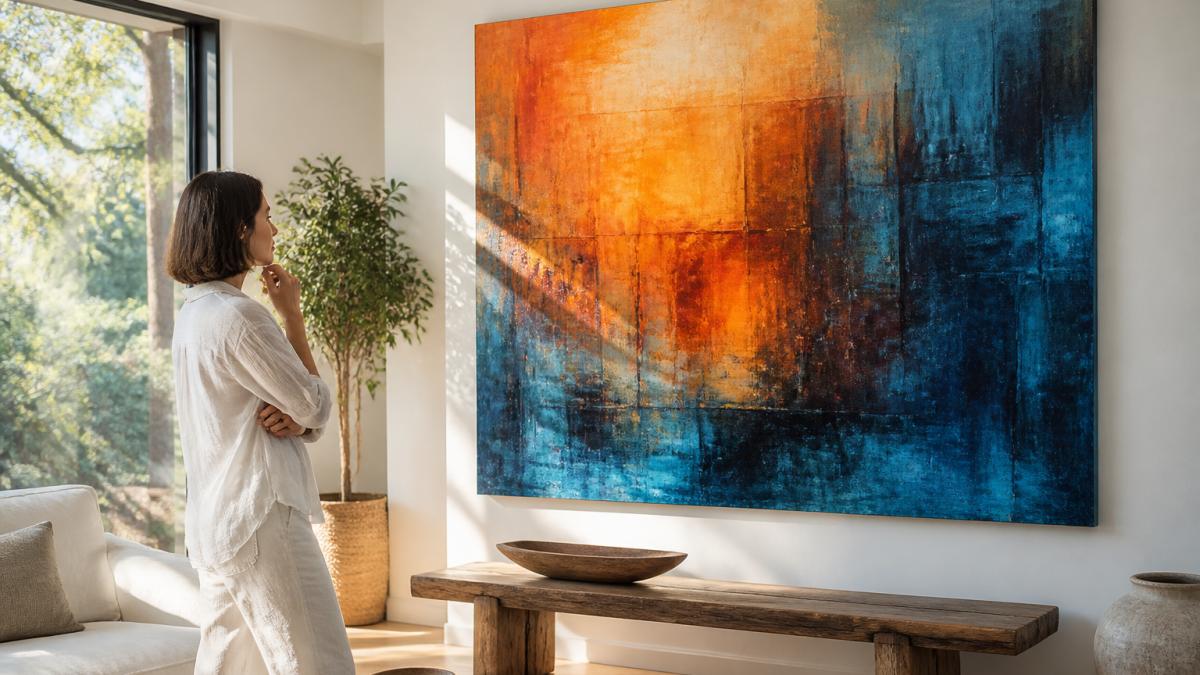
Here's a quick starting guide:
- Blues and greens: calm, rest, reflection
- Oranges and reds: energy, warmth, movement
- Yellows: optimism, lightness
Treat these as starting points, not rules. The section below explains why.
Color Meaning Is Personal and Cultural
The same blue that feels peaceful to one buyer can feel cold to another. Culture, memory, and personal history shape how you read a color, a shade that reminds you of a childhood kitchen won't land the same way for a stranger.
So test your reaction honestly. Sit with an image for a full minute. Notice your first physical response, not your first thought. That gut reaction is better data than any color chart.
Choosing Art for a Calming Space
"Calming" is not a property of a painting but of the interaction between the painting, the wall, the light, and the viewer, which is why two buyers can stand before the same muted blue canvas and feel completely different things. Stop hunting for a universally calming piece and start testing candidates against your own nervous system.
The Four Variables That Actually Lower Arousal
Most advice stops at "pick soft colors", one variable out of four. Score each candidate on all four:
- Value contrast. This matters more than hue. A painting with high contrast between its lightest and darkest areas creates visual tension regardless of whether the colors are blue or orange. Look for pieces where the darkest tone and lightest tone sit closer together on the value scale. Squint at the image, if it still reads as busy, it will read as busy on your wall.
- Edge quality. Hard, crisp edges read as decisive and alerting. Soft, blended, or lost edges read as restful. A single hard edge in an otherwise soft field can act as an anchor rather than a disruption, so don't reject a piece for having one.
- Density of marks. Count the distinct gestures in a square foot. A piece with three large washes behaves very differently at 8 feet than a piece with three hundred small strokes, even if the palettes are identical.
Viewing Distance Changes Everything
A painting that feels serene from across a room can feel agitated from three feet away, because mark density and edge quality are distance-dependent. Before you commit, view the image at the scale you'll actually experience it:
- On a phone screen, most abstract work looks calmer than it will in person, because fine texture disappears.
- Ask the seller for a photo of the piece on a wall, taken from the seating position where you plan to look at it most.
- If you can only see it online, view it at 100 percent zoom to judge texture, then zoom out to judge composition. You are buying both.
Lighting Is Half the Equation
Matte finishes scatter light and hold softness; glossy finishes and resin coatings create specular highlights that add flicker and visual noise, working against a calming goal. If the piece hangs opposite or adjacent to a window, pick matte. If the wall gets no direct light, a slightly glossier finish keeps colors from going flat.
A Quick Self-Test Before You Buy
Sit with the image for 60 seconds, then notice three things: your shoulders, your jaw, and your breathing rate. If any tightened, the piece is not calming for you, no matter what the color chart says. If they stayed level or softened, you have your answer, personal reaction outranks every rule here.
A Step-by-Step Framework for Choosing Abstract Art for Emotional Healing
Use this five-step framework to move from feeling to purchase without second-guessing yourself.
- Name your goal. Write one feeling: calm, energy, comfort, or courage.
- Set your palette. Pick two or three colors that match that feeling.
- Match the composition. Choose soft shapes for calm, bold shapes for energy.
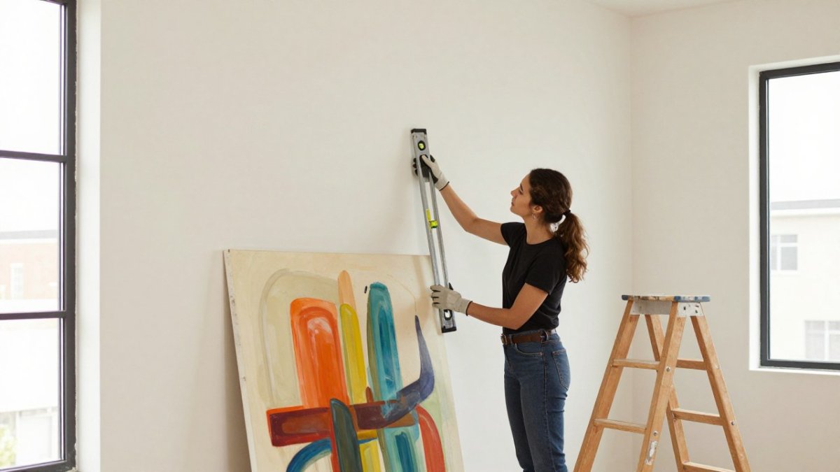
- Check the scale. Measure the wall and pick a size that fills 60 to 75 percent of the available width.
- Live with it for a day. Save the image, look at it tomorrow, and buy only if it still moves you.
Match the Piece to Your Emotional Goal
| Your Goal | Color Direction | Shape and Texture | Best Placement |
|---|---|---|---|
| Calm | Blues, greens, soft neutrals | Flowing shapes, smooth texture | Bedroom, reading nook |
| Energy | Oranges, reds, bright yellows | Bold marks, layered texture | Entryway, home office |
| Comfort | Warm earth tones, creams | Rounded forms, soft edges | Living room, hallway |
| Reflection | Deep blues, purples, grays | Open space, minimal marks | Study, quiet corner |
This table is a starting point. Your own reaction always outranks it.
Art Therapy Exercises for Emotional Healing at Home
You don't need training to use art at home. Simple art therapy exercises for emotional healing can help you process stress, grief, and difficult emotions through color and movement.
Try these:
- Color wash: Paint one color, then blend a second into it while wet. Notice what shifts.
- Three-line drawing: Make three marks that match your mood, then step back and look.
- Grief palette: Choose colors for a loss you're carrying and put them on one page.
The narrative review on art therapy's healing potential notes that this kind of open, unstructured creative work helps people express what words can't reach. Keep the output private. The point is the process, not the product.
Practical Considerations for Buying and Displaying Abstract Art
Once you have a shortlist, the decision shifts from taste to logistics, where most buyers make expensive mistakes, because the qualities that make a piece emotionally right often make it hard to place well.
Evaluate The Piece Against Your Emotional Goal
Run every candidate through the same five criteria so you can compare them side by side:
- Emotional response. Does it move you on the second viewing, not just the first? Save the image and look again the next day.
- Color intensity. Saturated, high-chroma palettes raise energy. Desaturated, grayed-down palettes lower it. Match the intensity to the feeling you named at the start.
- Composition. Where does your eye go first, and does it stay there or get pulled around? A single clear focal point reads as settled; competing focal points read as active.
- Subjectivity. Does the piece remind you of something specific, a place, a person, a period of your life? Personal association is a feature, not a bias, but name it out loud so you know what you are buying.
- Viewing distance. Judge it at the distance you will actually see it most. A piece that works from the sofa may not work from the hallway.
Match The Piece To The Goal, Not The Trend
A common pattern is to buy for the room's color scheme and then wonder why the piece feels inert. Buy for the feeling and let the room adjust. Seeking calm? Prioritize low value contrast, soft edges, and open negative space. Energy? High chroma, hard edges, dense mark-making. Comfort? Warm earth tones, rounded forms, matte surfaces. Reflection? Deep, low-chroma palettes and generous empty space.
Scale, Placement, And The 60-75 Percent Rule
For a single statement piece, fill roughly 60 to 75 percent of the available wall width, below that it looks lost, above it the wall feels crowded. For a gallery grouping, treat the cluster as one unit and apply the same ratio to its outer dimensions. Hang the center at roughly eye level for the person who looks at it most, typically 57 to 60 inches from the floor, shifting if the piece hangs above furniture.
Lighting, Framing, And Long-Term Fit
- Lighting. Natural light flatters most abstract work, but direct sun will fade pigments over years. If the wall gets strong afternoon sun, consider UV-filtering glazing or a location that gets indirect light.
- Framing. A floater frame lets a deep canvas breathe; a traditional frame can contain a busy composition. Unframed canvas is the most renter-friendly and travels best.
- Longevity. Ask yourself whether the piece will still feel supportive in five years. Emotional needs shift, and a painting that once read as energizing can start to read as restless. That is not a failure, it is a signal that your relationship with the work has changed.
Buying Online: What To Verify
- Scale references. Ask for a photo with a person, sofa, or doorframe next to the piece. Dimensions alone rarely convey true size.
- Originality. Confirm whether the work is one-of-a-kind or a reproduction, and get that in writing.
- Return and damage policy. Read the terms before checkout, not after. A verified secure checkout should come with clear, written terms.
For a sense of how art buying fits into broader well-being research, see the 2026 study on viewing art and psychological well-being.
When to Seek Professional Support
Art can support emotional healing, but it is not treatment. If you're dealing with depression, anxiety, trauma, or grief that won't lift, talk to a licensed therapist or counselor.
Use art as one part of a wider support system. If your mood stays low for weeks, or daily life feels unmanageable, reach out to a professional. That step is strength, not weakness.
Frequently Asked Questions
How can abstract art support emotional well-being?
Research suggests viewing art can support emotional well-being. A 2026 study published in Emotion found that viewing art led to greater subjective well-being and lower stress than a neutral or positive activity. A 2025 systematic review in The Journal of Positive Psychology noted possible effects on emotion regulation, pleasure, and stress reduction. Choosing a piece that resonates with you, whether through color, texture, or composition, may help create a calming, reflective space in your home.
How do I choose art that reflects how I feel?
Start by noticing your emotional state. Are you seeking calm, energy, comfort, or release? Then look for abstract art whose colors, shapes, and texture match that feeling. For example, soft blues and greens often feel calming, while bold reds and oranges can feel energizing. Trust your first physical reaction. If a piece makes you pause or breathe deeper, it may be the right fit for your emotional healing journey.
What colors in abstract art can feel calming or energizing?
Cool colors like blue, green, and soft violet often feel calming, making them a good choice for a calming space such as a bedroom or reading nook. Warm colors like red, orange, and yellow tend to feel energizing and can work well in spaces where you want motivation or social energy. Personal and cultural associations matter too, so notice which colors consistently lift or settle your mood before you buy.
Is art therapy the same as choosing or viewing art?
No. Art therapy is a professional mental health practice led by a trained therapist, often using creative exercises to help process emotions. Choosing or viewing abstract art is a personal, everyday activity that can support emotional awareness and stress relief but is not a replacement for therapy. If you are dealing with grief, trauma, or persistent anxiety, consider working with a licensed therapist alongside enjoying art at home.
Finding a piece that truly speaks to your emotional needs can feel overwhelming, especially when so much art online looks alike. At Susan Fielder Art, we offer emotionally charged original abstract paintings, and 10 percent of every purchase supports pancreatic cancer research. Each piece carries a story of healing and resilience. Shop now and bring a work that means something into your space.