 how-to
Choosing Calming Wall Colors for Meditation Spaces
Table of Contents
- Understanding Color Psychology for Meditation Spaces
- Best Colors for a Meditation Room
- How Lighting Affects Paint Color in Your Space
- Yoga Room Paint Color Ideas and Room-Specific Selection
- Testing and Sampling Wall Colors Before Committing
- Choosing Calming Wall Colors: Paint Finish and Maintenance
- Designing Small and Shared Meditation Spaces
- Frequently Asked Questions
Last Updated: October 19, 2026
Understanding Color Psychology for Meditation Spaces
Color psychology studies how colors influence mood, emotion, and behavior. In meditation spaces, the right wall color guides your mind toward calm and focus.
Colors work through biology and association. Cool tones like blues and greens activate your parasympathetic nervous system, responsible for rest and recovery.
Meditation requires your nervous system to shift into a receptive mode.
Best Colors for a Meditation Room
The most effective meditation room colors are soft, muted, and lean toward cooler temperatures. Within that range, different shades serve different purposes.
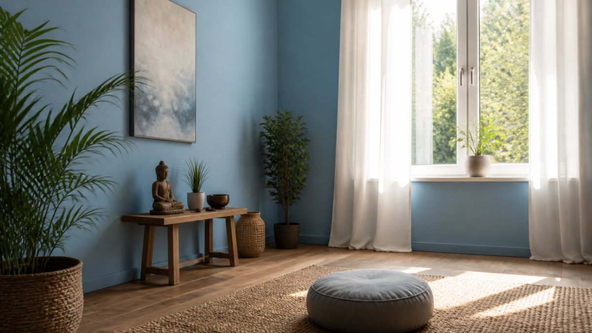
Soft Blues and Serene Blues
Soft blue is arguably the most popular choice for meditation spaces. Blue naturally reduces mental activity and slows heart rate, and its associations with sky and water signal openness and safety.
The key is the right shade. Bright, saturated blues energize; choose soft, muted blues like pale sky blue, dusty blue, or blue-gray.
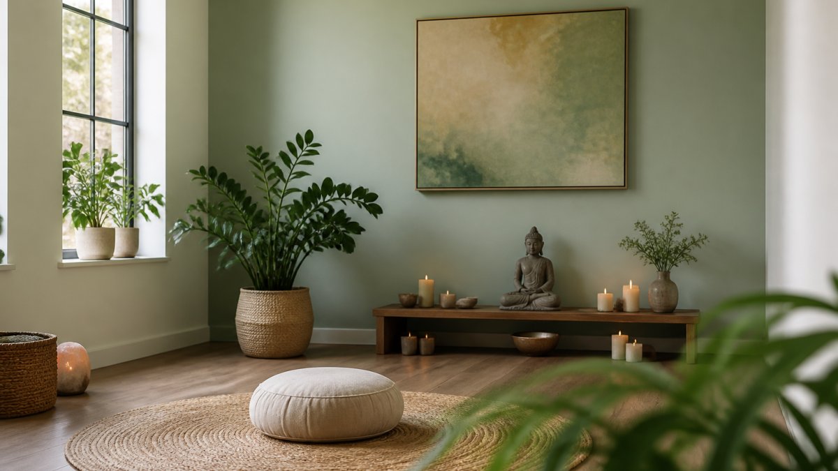
Soft blue pairs beautifully with natural wood, light textiles, and minimal furnishings, receding rather than demanding attention so your focus turns inward.
Gentle Greens and Nature-Inspired Palettes
Green connects us to nature. Unlike expansive, sky-like blue, green feels grounding and restorative.
Nature-inspired palettes go beyond a single green wall. Pair a gentle green with natural wood accents, stone textures, or earth-toned rugs to create a cohesive retreat.
Green works especially well for extended meditation, supporting sustained focus without fatigue, and it complements many decor styles and lighting conditions.
Soothing Neutrals: White, Cream, Beige, and Light Gray
Neutrals are often overlooked in meditation design but are incredibly powerful.
Light gray and warm beige offer similar benefits with slightly more visual weight, feeling less clinical than pure white, and work well in smaller or low-light rooms.
Finish matters: matte or chalky feels more meditative than glossy, which reflects light and creates visual movement that pulls attention outward.
Muted Pastels and Soft Tones
Muted pastels, soft lavender, pale peach, dusty rose, are pale, desaturated colors that offer color without stimulation.
These tones suit practitioners who find pure neutrals too stark but want something softer than saturated blues or greens, and they work in shared spaces.
The rule with pastels: the more desaturated (closer to gray), the more meditative the effect. If it looks vibrant, it's too saturated.
How Lighting Affects Paint Color in Your Space
Paint color lives in light. The same blue looks entirely different under morning versus evening light, often more than two adjacent paint chips differ. Understanding lighting is essential when choosing calming wall colors for meditation spaces.
Daylight direction and the color shift you'll actually see
Window direction sets the baseline cast:
- North-facing rooms get cool, consistent, indirect light. Blues and cool grays stay serene, the most forgiving exposure for cool palettes.
- South-facing rooms get warm, strong light most of the day. Cool colors can read cold or washed out at midday; warm neutrals glow.
- East-facing rooms have bright, cool morning light that fades to neutral by afternoon. A soft green fresh at 8 AM may feel flat by 4 PM.
Practical rule: sample the color at the two hours you actually sit. If you meditate at 7 AM and 9 PM, those are the only lighting conditions that matter.
Artificial light temperature changes the wall
If you meditate in the evening or in limited daylight, your bulbs do most of the color work. Color temperature is measured in kelvin (K):
- 2700K warm white adds a yellow-amber cast, softening cool blues and grays and cozying warm neutrals, but it can muddy pale lavender or make cool gray look beige.
- 3000K soft white keeps most calming colors close to their daylight appearance.
- 4000K cool white and above enhances blues and grays and crisps greens, but can feel clinical as the only source.
A common pattern is a 2700K-3000K main fixture plus a dimmable secondary source. Dimming matters as much as temperature: at low output, saturated colors desaturate, so a medium blue can read almost gray. Test at the brightness you'll actually use.
Sheen changes perceived color, not just shine
Finish affects how light bounces and how deep or flat a color appears:
- Matte (flat) absorbs light, softens edges, and hides imperfections, making colors look deeper and more velvety, ideal for meditation rooms.
- Eggshell has a low sheen, is easier to clean, and reads slightly lighter than matte.
- Satin and semi-gloss reflect more light and create hotspots and movement that pull attention outward, working against stillness.
For a meditation space, matte or eggshell is usually right. In strong direct sun, eggshell is the practical compromise since matte scuffs easily.
A repeatable sampling protocol
- Buy sample pots in your top two or three colors.
- Paint swatches at least 2 feet by 2 feet on two different walls, ideally one that gets direct light and one that stays shaded.
- Label each swatch and note the time and light source.
- Observe them over at least three to five days, at your actual practice times, with your actual bulbs on and off.
- Sit beside each swatch for a few minutes and notice your breathing and mental state, not just the color.
If you can't paint, sample with removable peel-and-stick swatches or a small painted board you can move around the room. This lets you test the color against your real walls, trim, and furniture before committing.
Yoga Room Paint Color Ideas and Room-Specific Selection
Yoga rooms serve multiple purposes, active practice, restorative poses, and sometimes meditation, so your color choice needs flexibility.
Soft blues and gentle greens work well because they don't overstimulate during active practice but still support calm during restorative sequences.
For a yoga room that doubles as a meditation space, avoid colors that feel too energizing.
Consider the room's purpose beyond yoga.
Testing and Sampling Wall Colors Before Committing
Choosing the right color is a process, not a guess. Before painting your entire meditation room, test your color choice thoroughly.
Purchase sample pots in your top 2-3 color choices.
Notice which sample draws your focus inward and which feels distracting, and how each affects your breathing and mental state when you sit near it.
Also consider how the color looks next to your furniture, rugs, cushions, and any artwork.
Renters or anyone hesitant about commitment: Use removable wallpaper or paint samples that stay up for weeks. This lets you experience the color in your actual space without permanent changes.
Choosing Calming Wall Colors: Paint Finish and Maintenance
The finish of your paint affects both how the color appears and how the space feels.
For meditation spaces, matte or eggshell finishes are ideal. They reduce glare, which supports sustained focus.
Maintenance is straightforward with most finishes.
Consider low-VOC (volatile organic compound) paints. These emit fewer chemicals, which means your meditation space stays fresh and healthy.
Designing Small and Shared Meditation Spaces
Most meditation spaces aren't dedicated rooms. They're a corner of a bedroom, a section of a living room, a rental you can't repaint, or a room with one small window. Color selection changes when space, light, and control are limited, and this is where generic calming-color advice tends to fall short.
Small spaces and corners
Small rooms need careful color selection. Dark or saturated colors make small spaces feel cramped, while light, soft colors make them feel open and expansive. For choosing calming wall colors for meditation spaces that are small, stick to very pale versions of your preferred color family. A pale blue feels more spacious than a medium blue. Cream feels larger than beige.
A few specifics that help in practice:
- Paint the whole corner, not just one wall. A single accent wall in a small space can chop the room visually. Carrying one pale color across adjacent walls makes a corner read as a deliberate zone.
- Match the ceiling and trim to the wall or go one shade lighter. High contrast between wall and ceiling lowers the perceived ceiling height.
- Use a matte finish to blur corners. Matte reduces the shadow lines that make small rooms feel boxy.
Rooms with limited natural light
Low-light rooms are the hardest case. Pale colors can turn gray and flat without daylight, and cool blues can feel cold. In these rooms:
- Favor warm-leaning neutrals (cream, warm light gray, greige) over cool blues and grays.
- Choose a paint with a slightly higher light reflectance value (LRV). LRV runs from 0 (black) to 100 (white); most paint brands print it on the chip. A wall color in roughly the 70-85 LRV range bounces more light back into the room than a mid-tone in the 40s or 50s.
- Add a warm 2700K-3000K lamp near the wall you face. The wall color and the bulb temperature work together.
Rentals and spaces you can't repaint
If you rent or can't commit to paint, you still control the visual field:
- Removable wallpaper in a soft, low-contrast pattern can cover one wall and come down at move-out.
- Peel-and-stick paint swatches let you live with a color for weeks before deciding.
- A large canvas or fabric hanging in a calming tone can act as your "wall color" on the wall you face during practice.
Renters or anyone hesitant about commitment: Use removable wallpaper or oversized fabric panels to test a calming tone on the wall you actually face, then commit to paint only if the color works in your real light.
Shared and multipurpose rooms
Shared spaces present a different challenge. If multiple people use the room for meditation, you need a color that works for most people's preferences and nervous systems.
In shared spaces, let the wall be simple and let decor carry personality. A neutral wall with meaningful art, cushions, and plants creates a flexible environment that serves multiple practitioners.
Sensory and accessibility considerations
Color psychology isn't universal. Visual sensitivity, contrast needs, and color-vision differences all affect how a wall color lands:
- High contrast can be agitating. Strong wall-to-trim contrast creates visual edges that pull the eye. Low-contrast palettes (wall, trim, and ceiling within a few shades) are gentler for most people.
- Color-vision differences mean some people perceive blues and greens differently. A palette that relies on subtle blue-green distinctions may not read as intended for everyone. Favor palettes that work on lightness and warmth rather than fine hue differences.
- Personal associations matter more than trend. A color linked to a stressful memory won't calm you regardless of what a color-psychology chart says. Treat general guidance as a starting point, then trust your own response in the actual room.
A simple test: sit in the space for ten minutes with the sample in view and notice whether your shoulders drop or your jaw tightens. That response is more useful than any universal color rule.
Frequently Asked Questions
What colors are best for a meditation room?
Soft blues, gentle greens, and soothing neutrals like cream and light gray are ideal for meditation spaces. These calming wall colors reduce mental chatter and promote relaxation. Blues lower heart rate and blood pressure, greens connect you to nature and balance emotions, and neutrals create an open, uncluttered visual atmosphere. Choose colors that feel personally restorative, what calms one person may differ for another based on sensory preferences and past associations.
How does lighting affect paint color in a meditation room?
Natural light, warm incandescent bulbs, and cool LED lights all shift how your chosen paint color appears. North-facing rooms receive cool, steady light that can make warm tones feel dull; south-facing rooms get warm, bright light that intensifies color saturation. Always test paint samples on your actual wall at different times of day and under your room's lighting conditions. What looks perfect at the paint store may appear entirely different in your space, so invest time in sampling before final selection.
Should I use warm or cool tones in a meditation space?
Cool tones (blues, greens, cool grays) are generally more calming and promote relaxation, making them ideal for meditation rooms. Warm tones (soft peachy creams, warm beiges) can feel comforting but may energize rather than settle the mind. However, personal preference matters, some people find warm, earthy tones deeply soothing. Consider your room's purpose: a yoga room benefits from cool tones, while a bedroom meditation corner might incorporate warm neutrals if that resonates with you.
What paint finish works best for a meditation room?
Matte or eggshell finishes are better than glossy for meditation spaces because they reduce light reflection and visual distraction, creating a softer visual atmosphere. Matte finishes are less durable and harder to clean, so eggshell offers a practical middle ground, it's wipeable and maintains a calm appearance. Avoid high-gloss finishes, which bounce light and can feel jarring. When selecting your calming wall colors, pair them with a low-sheen finish to maximize the peaceful effect.