 how-to
Tips for Visualizing Art in Your Home
Table of Contents
- Why Visualizing Art Matters Before You Buy
- Best Apps to Visualize Art on Walls
- Physical DIY Visualization Techniques
- Abstract Paintings for Living Room Decor: Scale and Proportion
- How to Hang Art at the Right Height
- Creating Visual Cohesion With Your Art
- Common Visualization Mistakes to Avoid
- Conclusion
- Frequently Asked Questions
Last Updated: September 3, 2026
Why Visualizing Art Matters Before You Buy
The wrong art can make a room feel chaotic. The right piece transforms everything. Yet 91% of homeowners plan to use paint on their walls, while only 17% commit to original art, according to Houzz's 2026 Decorating Trends Survey. The gap isn't about preference, it's about confidence. Most people struggle with visualizing art in your home before spending money, so they default to what feels safe.
This hesitation costs you. Research shows that workers in spaces decorated with art and plants experience 32% higher productivity and 60% more engagement than those in bare environments, according to University of Exeter's workplace study. Art isn't decoration. It's an investment in how your space, and your mind, functions.
At Susan Fielder Art, we understand this friction. Buyers come to us asking the same question: "Will this actually look good in my space?" That's exactly why tips for visualizing art in your home matter before you commit. When you can see a piece in context, on your actual wall, with your actual light and furniture, the decision becomes clear. You stop guessing and start knowing.
Best Apps to Visualize Art on Walls
Digital preview tools have become essential for online art purchases. Augmented reality (AR) visualization apps let you place artwork on your walls in real time, seeing exactly how scale, color, and proportion interact with your space.
The best apps for visualizing art on walls use your phone's camera to overlay digital images onto physical spaces. When customers used AR tools to preview wall art, conversion rates increased by 78%, average order value jumped 27%, and returns dropped 42%, according to Shopify's 2026 research on visualization tools. That's not marginal improvement, that's transformative.
Here's what to look for in a visualization app:
- Real-scale rendering, The app shows artwork at actual size, not a tiny preview
- Lighting adjustment, You can simulate different times of day and light sources
- Multiple wall angles, Preview the piece from different viewing distances and positions
- Color accuracy, The app's color reproduction matches the actual product
- Easy sharing, Save or share your visualization with family or a designer
Many online art retailers now embed visualization tools directly on their product pages. When shopping for abstract paintings or photography, check whether the seller offers this feature. If they do, use it. The 30 seconds it takes to visualize can save you from a costly mistake.
Physical DIY Visualization Techniques
Not every visualization happens on a screen. Sometimes the most effective method is tactile and immediate.
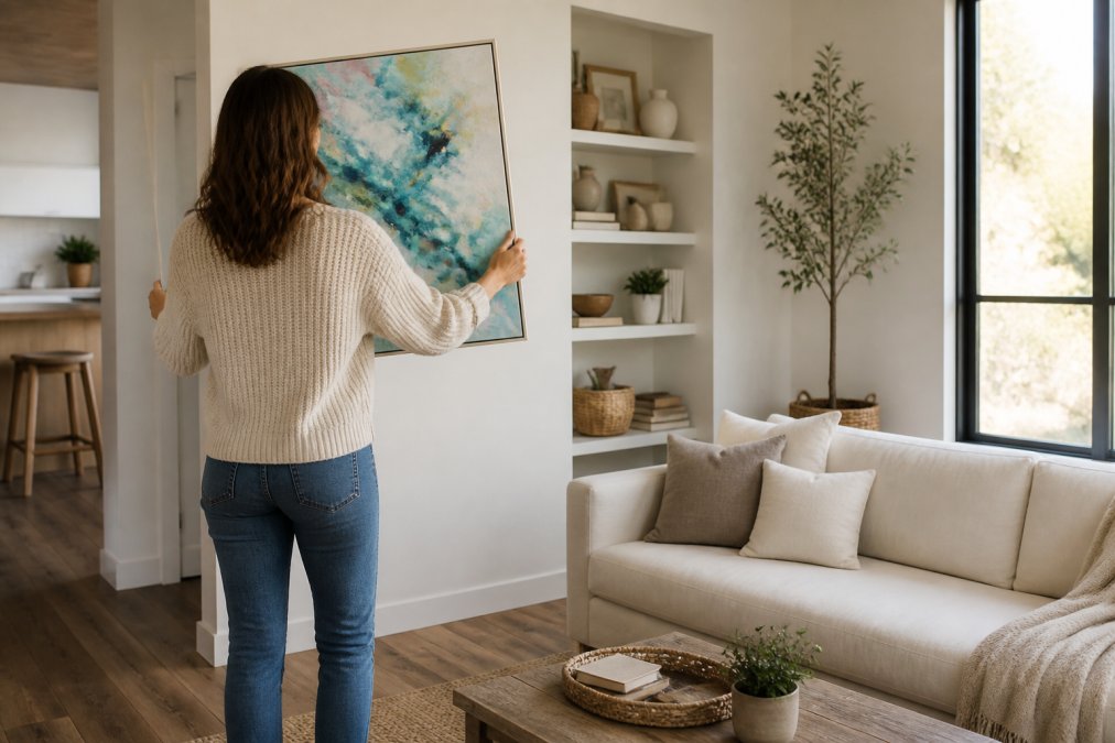
Paper cutouts remain one of the most reliable tips for visualizing art in your home. Measure your chosen artwork's dimensions. Cut a piece of kraft paper or cardboard to match. Tape it to your wall and live with it for a few days. Walk past it in morning light, evening light, and artificial light. Sit on your furniture and look at it from your actual viewing angle. This low-tech approach reveals proportion problems that apps sometimes miss.
String and tape method works for gallery walls. Mark your wall with painter's tape in the configuration you're planning. Stand back. Does the layout feel balanced? Does it frame your furniture or compete with it? Adjust before you hang a single nail.
Furniture arrangement first sounds backward, but it's essential. Arrange your seating and major pieces. Then identify wall space in relation to where people actually sit and stand. A piece that looks awkward when centered might feel perfect when positioned above a sofa or console. Your furniture layout determines your viewing angle, which determines ideal scale and height.
Lighting test uses your phone's flashlight or a portable lamp. Move it around your wall space at different angles. Notice how light hits the wall, bright, shadowed, or uneven. Matte finishes and textured pieces behave differently under various light conditions. Metal prints, for example, reflect light dramatically and work best in spaces with controlled, directional lighting.
Color matching with existing objects gives you a concrete reference. Hold paint chips, fabric swatches, or photos of artwork next to your furniture, rugs, and wall color. Step back. Does the color feel cohesive or jarring? Does it enhance the room's mood or fight against it?
These physical methods take time, but they're free and they work. Many people skip them because digital tools feel faster. They're not, they're just more convenient. Convenience and accuracy aren't the same thing.
Abstract Paintings for Living Room Decor: Scale and Proportion
Scale determines impact. A painting that's too small disappears. Too large, and it overwhelms. Getting this right is one of the most critical tips for visualizing art in your home.
The general guideline is straightforward: a single piece above a sofa should span roughly two-thirds of the furniture's width. For empty walls, fill 60-75% of the available space. When in doubt, go larger. Undersized art is the most common mistake homeowners make, according to interior design experts who consistently see clients choosing pieces that are too small for their walls.
Here's the math: measure your wall width. Multiply by 0.65 (roughly two-thirds). That's your target artwork width. A 72-inch-wide sofa suggests a piece around 48 inches wide. A 10-foot wall with no furniture suggests artwork 72-90 inches wide.
Abstract paintings for living room decor benefit from bold scale. Abstract work relies on color, texture, and composition, not narrative detail, to create impact. A small abstract piece gets lost. A large one commands attention and sets the room's emotional tone. This is why oversized canvases are trending in 2026. They transform a room instantly.
Proportion extends beyond width. Consider height too. Tall, vertical pieces emphasize ceiling height and draw the eye upward. Wide, horizontal pieces ground a space and create calm. A room with high ceilings can handle taller pieces. A smaller room with standard 8-foot ceilings benefits from wider, more horizontal compositions.
How to Hang Art at the Right Height
Eye level is the universal standard, and it's non-negotiable for how to hang art at the right height.
Eye level for viewing is approximately 57-60 inches from the floor to the center of the artwork. This is where a standing person's eyes naturally focus. When you hang art at this height, it feels intentional and properly placed.
But context matters. If your art hangs above furniture, a sofa, console table, or bed, the math changes slightly. Measure the height of that furniture. Add 6-12 inches above it. That's your hanging height. This creates visual connection between the art and the furniture without feeling cramped.
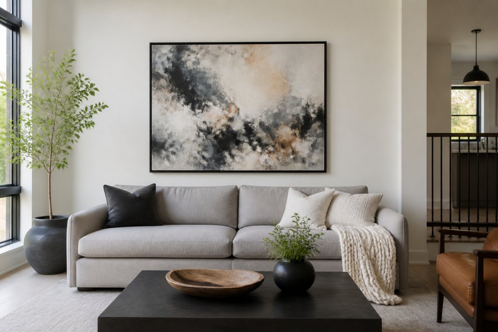
For gallery walls, the eye-level rule still applies, but to the center of the entire composition. If you're hanging five pieces in a grid, imagine a line through the middle of that grid. That line should sit at 57-60 inches. Pieces above and below it will naturally fall into place.
Accessibility matters too. If your home includes people with mobility limitations, hanging art lower, around 48-54 inches, ensures it's visible from a seated position. This isn't a compromise on design; it's an expansion of it. Lower-hung art can feel more intimate and engaging for everyone.
Use a level when hanging. Crooked art catches the eye immediately and makes the entire room feel off-balance. Spend the extra minute getting it straight.
Creating Visual Cohesion With Your Art
Cohesion doesn't mean matching. It means intentional relationship.
Visual cohesion happens when your art feels like it belongs in the room rather than placed randomly. This is where visualizing art in your home becomes strategic. You're not just asking "Is this pretty?" You're asking "Does this speak the same visual language as the rest of the space?"
Start with color palette. Your art doesn't need to match your walls or furniture exactly. But it should relate to them. If your room uses warm neutrals, beiges, taupes, soft golds, your art should either echo those tones or provide intentional contrast. Warm abstract paintings with terracotta, sand, and muted gold create harmony. A piece with electric blues and hot pinks creates drama. Both work, but they create different moods.
Texture adds another layer. If your room features smooth surfaces, glass, polished wood, clean fabrics, matte art with subtle texture creates interesting contrast. Rooms with lots of texture, woven rugs, linen upholstery, rough wood, benefit from art with visible brushwork or dimensional surfaces. Metal prints, for example, add reflective texture that complements modern spaces.
Style consistency matters less than you think. Mixing art styles, abstract with photography, contemporary with vintage, works when you control the color and emotional tone. A bold abstract piece and a black-and-white photograph can share a wall if they both feel serious and contemplative, or both feel energetic and playful.
The real rule: every piece should feel like it was chosen on purpose, not grabbed at random. That intentionality is what reads as cohesion.
Common Visualization Mistakes to Avoid
Most visualization errors stem from three habits: underscaling, overcrowding, and ignoring light.
Undersized art is mistake number one. People see a blank wall and think small. They worry a large piece will be "too much." It won't. Rooms with undersized art feel unfinished. The solution is simple: go one size larger than your instinct suggests.
Overcrowding happens when people try to fill every wall. Empty space isn't wasted space, it's breathing room. A single statement piece creates more impact than five mediocre pieces scattered across the wall. If you love multiple pieces, create a cohesive gallery wall with intentional spacing. Random placement reads as indecision.
Ignoring light is a silent killer. A piece that looks stunning in the gallery's bright, neutral lighting might feel dull under your home's warm incandescent bulbs or look washed out in harsh afternoon sun. Before committing, spend time in your space at different times of day. Notice how light changes. Visualize how your chosen piece will look under those actual conditions.
Hanging too high creates disconnect. Many people center art on the wall itself, which puts it too high. Center it on the furniture or at eye level instead.
Choosing by color alone ignores proportion and style. A beautiful blue abstract might clash with your room's aesthetic even if the blue matches your pillows. Evaluate the whole piece, composition, scale, emotional tone, not just color.
Skipping the visualization step costs money. Taking 20 minutes with an app or paper cutout prevents regretful purchases. This is time well spent.
Conclusion
Visualizing art before you buy transforms the entire process. You move from hoping a piece works to knowing it will. Whether you use digital apps, paper cutouts, or physical arrangement techniques, the goal is the same: see your art in context before money changes hands.
Susan Fielder Art's collection of emotionally resonant abstract paintings is designed to transform your space with vibrant energy. Each piece reflects a narrative of healing and resilience, and with the 30-day money-back guarantee, you can visualize and experience the art in your home risk-free. Shop now and discover how the right piece can make your space feel intentional, cohesive, and truly yours.
| Visualization Method | Best For | Time Required | Cost |
|---|---|---|---|
| AR/Digital Apps | Online purchases, quick preview | 5-10 minutes | Free |
| Paper Cutouts | Scale and proportion testing | 15-30 minutes | Minimal |
| String and Tape | Gallery wall layout | 20-40 minutes | Minimal |
| Furniture Arrangement | Viewing angle and placement | 30-60 minutes | Free |
| Lighting Tests | Assessing how art interacts with light | 10-15 minutes | Free |
Frequently Asked Questions
What is the 2/3 rule for wall art when visualizing art in your home?
The 2/3 rule suggests that a single piece of art above furniture, like a sofa, should span approximately two-thirds of that furniture's width. This creates proper visual balance and ensures your art doesn't look undersized in the space. For empty walls, aim to fill 60-75% of the available wall expanse with your artwork. When in doubt, choosing larger, simpler pieces works better than smaller, busier ones.
How can I see how a painting looks on my wall before buying abstract paintings for my living room?
Use augmented reality apps that let you preview artwork in real scale on your wall using your smartphone camera. These tools show how color, size, and style interact with your actual room lighting and décor. You can also use physical DIY methods: print a to-scale version of the artwork, tape it to your wall, and live with it for a few days. This helps you assess whether the piece feels right emotionally and aesthetically in your space.
What should I consider when choosing the right size art for my living room wall?
Measure your wall space and furniture dimensions first. For a sofa, the artwork should be 60-75% of its width. Consider the room's scale: oversized statement pieces work well in larger rooms and create stronger focal points, while smaller rooms benefit from proportionally scaled art. Account for negative space around the piece and how it relates to other décor elements. Larger, simpler pieces generally have more visual impact than multiple smaller works in the same space.
How much of my purchase actually supports pancreatic cancer research when buying from Susan Fielder Art?
Susan Fielder Art donates 10% of all proceeds to pancreatic cancer research, ensuring your purchase directly supports a meaningful cause. This commitment is built into every transaction, whether you're buying an original abstract painting, canvas print, framed print, metal print, or lifestyle product. The iPlaid collection specifically raises awareness for pancreatic cancer research, combining artistic expression with genuine charitable impact.