 how-to
How to Choose Abstract Art for Home: A 7-Step Guide
Table of Contents
- Assess Your Space and Wall Size
- Establish Your Color Palette and Emotional Response
- How to Choose Abstract Art That Matches Your Interior Design Style
- Evaluate Canvas Size, Scale, and Proportion
- How to Hang Abstract Art and Optimize Placement
- Abstract Art Color Palette Ideas for Every Room
- Consider Lighting, Medium, and Preservation
- Verify Authenticity and Use Virtual Visualization Tools
- Frequently Asked Questions
Last Updated: August 3, 2026
Selecting abstract art for your home requires a thoughtful approach that goes beyond simply picking a piece you like. At Susan Fielder Art, we understand that choosing the right abstract painting involves considering your space, emotional connection, and design goals. This guide walks you through a structured seven-step process to help you choose abstract art that truly resonates with your home environment and personal aesthetic.
Most homeowners struggle not with a lack of beautiful abstract art, but with knowing which pieces will work in their specific spaces. Below, we'll show you exactly how to evaluate your space, establish a cohesive color palette, match art to your design style, and use practical tools to visualize pieces before committing.
Assess Your Space and Wall Size
Your room's physical dimensions are the foundation for every decision you'll make about abstract art selection. Start by measuring your wall dimensions carefully with a tape measure, noting the ceiling height, floor level, and any architectural features like windows, doors, or built-in shelving that will affect placement.
Abstract paintings create visual presence beyond their physical dimensions. A large, bold painting with dark colors carries more visual weight than a smaller piece with soft pastels. In a small bedroom, a massive statement piece can feel overwhelming. In a large living room with high ceilings, a tiny painting might disappear into the wall.
Consider how the room functions. A busy hallway benefits from art with clear focal points and strong visual impact. A meditation room might call for something more subtle that invites prolonged viewing without overwhelming the senses.
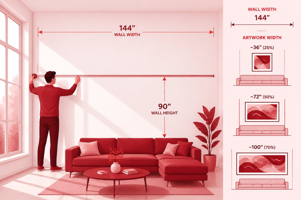
The relationship between your wall and surrounding elements matters significantly. If your sofa is five feet wide, hanging a four-foot painting above it creates better visual balance than a two-foot piece. If your wall is predominantly empty with minimal furniture, you have freedom to go larger.
Establish Your Color Palette and Emotional Response
Abstract art communicates primarily through color and form. The colors you choose will either harmonize with your existing décor or create intentional contrast, and both approaches work when executed thoughtfully.
Warm colors like reds, oranges, and yellows energize a space and make rooms feel more intimate. Cool colors like blues, greens, and purples create calm and spaciousness. Neutral tones ground a room and allow other design elements to shine. Sharp, angular forms feel dynamic and modern, while curved, flowing shapes feel organic and soothing.
Before selecting a piece, identify the emotional response you want from your space. Do you want to feel energized and inspired, or calm and grounded? Your answer determines which color palettes and compositional styles will work best.
Creating color harmony with your existing décor doesn't mean everything must match perfectly. Some of the most sophisticated spaces use abstract art to introduce a complementary color that appears nowhere else in the room. If your furniture and walls are predominantly neutral, a vibrant abstract painting becomes a focal point. If your room already contains multiple colors, choosing abstract art that echoes one of those colors creates visual cohesion.
How to Choose Abstract Art That Matches Your Interior Design Style
Abstract art exists across a spectrum from minimalist to maximalist, and your interior design style should guide where you land on that spectrum.
Minimalist approaches feature limited color palettes, clean lines, and large areas of negative space. A single large painting with two or three colors and plenty of white space complements minimalist design perfectly. Maximalist approaches embrace bold colors, pattern, texture, and visual abundance. Abstract art with multiple colors, complex compositions, and rich texture will enhance rather than compete with your existing décor.
Eclectic approaches mix styles intentionally. When choosing abstract art for an eclectic space, you have more freedom to select based on emotional resonance. The key is ensuring your abstract art doesn't feel random, it should connect to at least one or two elements already present in your design scheme.
Industrial spaces with exposed brick and metal accents pair well with bold, geometric abstract art. Farmhouse or cottage styles benefit from abstract art with organic shapes and warmer palettes. Contemporary spaces work with almost any abstract style, but clean-lined, sophisticated pieces feel most at home. Bohemian spaces can embrace more expressive, colorful abstract work with visible brushstrokes and layered composition.
Evaluate Canvas Size, Scale, and Proportion
Getting the scale right is one of the most common mistakes in art selection. A painting that looks stunning in a gallery or online can feel completely wrong once it's on your wall.
The general rule is that artwork should occupy 50-75% of the wall space above a piece of furniture, or 60-75% of the wall space in a room without furniture below. A wall that's eight feet wide calls for art roughly four to six feet wide. A wall that's twelve feet wide can handle art eight to nine feet wide.
Statement pieces are individual large paintings that command attention and serve as the room's primary focal point. A statement piece should be large enough to feel intentional, generally at least three feet in one dimension. Statement pieces work particularly well in entryways, above beds, or in rooms with simple, understated décor.
Gallery wall compositions use multiple smaller pieces arranged together to create a unified visual statement. They work well in spaces with more visual complexity or when you want to display multiple pieces without overwhelming the room. Gallery walls typically work best when pieces are similar in size and framing, or when they're deliberately varied in a cohesive way.
How to Hang Abstract Art and Optimize Placement
The placement and hanging technique you choose affects both the visual impact and the longevity of your artwork.
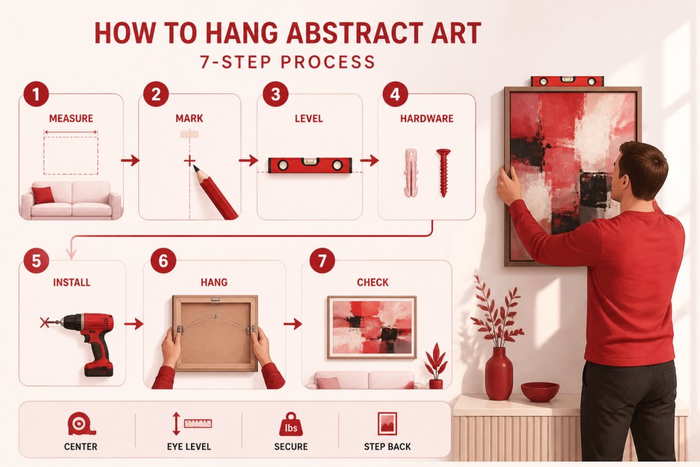
Hanging height is crucial. The standard recommendation is to hang art so that its center is at eye level, approximately 57-60 inches from the floor. However, if your art hangs above a sofa where people sit, measure from seated eye level instead, typically 40-48 inches from the floor.
Your abstract art should either be the primary focal point or should support an existing focal point. In a bedroom, art above the bed naturally becomes the focal point. In a living room, art might share focal point status with a fireplace or television.
Visual balance doesn't require symmetry. Asymmetrical balance, where a large piece on one side of the wall is balanced by other visual elements like a mirror, window, or furniture arrangement, creates more sophisticated, modern-feeling spaces. When hanging multiple pieces, maintain consistent spacing between them, typically 2-3 inches between frames creates a cohesive gallery wall. Use a level to ensure your pieces hang straight.
Abstract Art Color Palette Ideas for Every Room
Different rooms benefit from different color approaches based on their function and the mood you want to create.
For living rooms, consider color palettes that feel welcoming but not overwhelming. Warm neutrals with accent colors in jewel tones (emerald, sapphire, amethyst) create sophisticated, inviting spaces.
Bedrooms benefit from more restful color palettes. Soft blues, muted greens, warm grays, and gentle earth tones support relaxation. If you want more visual interest, introduce a complementary accent color in smaller quantities.
Home offices need to support focus and productivity. Consider colors that feel energizing without being distracting. Warm neutrals with touches of color, or soft blues with warm accents, create professional yet personable spaces.
Entryways and hallways are perfect places for statement-making color palettes because viewers spend less time in these spaces. Bold colors, high-contrast combinations, and dynamic compositions work beautifully here.
Complementary colors sit opposite each other on the color wheel, blue and orange, red and green, yellow and purple. Using complementary colors in abstract art creates visual excitement and energy. Room mood is ultimately determined by which colors dominate. Predominantly cool-toned art will make the room feel calm and spacious. Predominantly warm-toned art will feel cozy and intimate.
Consider Lighting, Medium, and Preservation
The way light interacts with your abstract art dramatically affects how it appears in your space. Natural light changes throughout the day, which means your art will appear different at sunrise, midday, and sunset. If your wall receives strong afternoon sun, avoid art with colors that will fade in direct sunlight. Reds, oranges, and some blues are particularly susceptible to fading.
Artificial lighting affects color perception significantly. Warm white bulbs (2700K color temperature) make warm colors in your art appear richer while cool colors appear muted. Cool white bulbs (5000K and above) enhance blues and greens while making warm colors appear slightly washed out.
The medium of your abstract art, acrylic, oil, watercolor, mixed media, affects both its appearance and its care requirements. Acrylic paintings are durable and low-maintenance, making them ideal for high-traffic areas. Oil paintings develop a beautiful patina over time but require more careful handling and climate control. Watercolors and delicate mixed media need protection from humidity and direct sunlight.
Preservation of abstract art involves proper framing, hanging, and environmental control. Keep your art away from direct sunlight, extreme temperature fluctuations, and high humidity. Dust gently with a soft, dry cloth.
Verify Authenticity and Use Virtual Visualization Tools
When purchasing abstract art, especially original artwork, authenticity matters both for investment value and for ensuring you're supporting the artist directly.
Confirming original artwork involves requesting a certificate of authenticity from the seller. Research the artist's background, exhibition history, and online presence. Legitimate artists maintain consistent pricing, have professional websites, and are represented by galleries.
For Susan Fielder Art pieces, each original painting comes with documentation confirming its authenticity and the artist's background. The gallery maintains transparent records of all original work, and every piece reflects the artist's personal narrative and artistic vision.
Virtual preview technology has revolutionized how people choose art for their homes. Many online galleries now offer augmented reality tools that let you visualize artwork on your actual walls using your smartphone camera. These tools show you exactly how a piece will look in your space, accounting for your wall color, lighting, and surrounding décor.
Some galleries offer physical samples or temporary display options. You might request a high-resolution digital image to print and tape to your wall temporarily, or ask about borrowing a piece on approval before committing to purchase.
When evaluating authenticity online, look for several credibility markers: professional website with clear artist information, transparent pricing, detailed product descriptions with dimensions and medium information, secure payment processing, customer reviews from verified purchases, and clear return or exchange policies.
Choosing abstract art for your home is ultimately about creating a space that reflects your personality and supports the way you live. By following this seven-step process, assessing your space, establishing your color palette, matching your design style, evaluating scale, optimizing placement, considering lighting and preservation, and verifying authenticity, you'll confidently select pieces that transform your environment. Susan Fielder Art offers a curated collection of emotionally resonant abstract paintings designed to bring vibrant energy and meaningful storytelling to your space. Each original piece reflects authentic artistic vision and comes with documentation confirming its legitimacy. Explore the gallery's collection and find the abstract art that speaks to your home and your heart.
Frequently Asked Questions
How do I know the abstract art I choose online will actually look good in my space?
Use virtual visualization tools to preview the artwork in your room before purchasing. Take photos of your wall in natural and artificial light, then use the brand's digital preview feature or your phone's AR capability to see how the piece fits your color palette and spatial layout. Check the canvas size against your wall dimensions, and review customer photos showing pieces in real homes similar to yours.
What's the difference between abstract art color palette ideas for different room styles?
Minimalist spaces work best with limited color palettes and geometric forms, while maximalist rooms embrace bold, layered compositions with complementary colors. Warm tones (oranges, reds, yellows) energize social spaces; cool tones (blues, purples, greens) calm bedrooms and offices. Match your abstract art's dominant colors to 60-70% of existing decor and use 30% as accent contrast to create visual balance and cohesive atmosphere.
How can I verify that abstract art is an original piece and not mass-produced?
Ask the artist or gallery for a certificate of authenticity, artist biography, and details about the medium and creation process. Original artwork should have unique characteristics like brushwork texture, slight color variations, and hand-signed details. Legitimate artists maintain consistent work and often document their creative journey. Verify the artist's registration with recognized art organizations, and request close-up photos showing surface texture and medium quality.
Does abstract art work with every interior design style, or will it clash with my decor?
Abstract art adapts to most interior design styles when you match its color harmony and composition to your existing aesthetic. Minimalist interiors pair well with geometric abstracts in neutral tones; maximalist spaces embrace vibrant, layered pieces. The key is choosing a focal point artwork that complements 60-70% of your room's color palette while adding 30% visual contrast. Consider your room's mood, lighting conditions, and existing furniture before selecting scale and composition.