 how-to
Choosing Art for Small Rooms: A Practical Guide
Table of Contents
- Why Choosing Art for Small Rooms Matters
- Best Wall Art Size for Small Rooms
- Color Palette and Background Selection
- Gallery Wall Layout Ideas for Small Walls
- Tips for Styling Abstract Paintings in Compact Homes
- Placement and Hanging Height
- Renter-Friendly Art Solutions
- Frequently Asked Questions
Last Updated: August 23, 2026
Why Choosing Art for Small Rooms Matters
The right artwork transforms a compact space from cramped to intentional. Strategic art placement can increase perceived room dimensions by up to 30%, a phenomenon known as 'visual breathing room' where artwork creates focal points that draw the eye beyond physical boundaries, according to environmental psychology research from MoMAA. This matters because most people living in smaller homes assume they need to minimize décor. The opposite is true.
When you choose art thoughtfully for a small room, you're not just hanging a picture. You're reshaping how your space feels. A well-selected piece becomes an anchor that makes the entire room feel more cohesive, more intentional, and larger than its actual square footage. This is why choosing art for small rooms requires a different strategy than decorating larger spaces.
According to a Buildworld survey of 1,000 homeowners, 62% of homeowners opted for photography pieces when choosing art for their walls, and nearly half preferred landscapes. Yet 46% of respondents have at least one piece of art in every room, and 63% were satisfied with their art decor decisions. These numbers reveal that homeowners understand art's power, they're just uncertain how to execute it properly in tight quarters.
At Susan Fielder Art, we recognize that small spaces demand precision. The emotionally charged abstract pieces in our collection are specifically designed to work in compact homes, transforming walls into statements of resilience and energy without overwhelming the room. The key is understanding proportion, color psychology, and placement, three elements that separate successful small-room art from pieces that feel out of place.
Best Wall Art Size for Small Rooms
The most common mistake when choosing art for small rooms is selecting pieces that are too small. Undersized artwork makes compact spaces feel more cramped, not less. Instead, embrace the two-thirds rule and consider bold statement pieces that anchor the room.
The Two-Thirds Rule
Artwork placed above furniture should typically be around two-thirds of the furniture width, according to interior design guidelines from Noonstead. This creates visual harmony and prevents the art from appearing insignificant.
For a sofa that's 6 feet wide, your artwork should be approximately 4 feet wide. For a 3-foot nightstand, aim for a 2-foot piece. This proportional balance ensures the art commands attention without overwhelming the room's scale.
The center of artwork on an empty wall should be hung around eye level, usually about 57 to 60 inches from the floor. This placement ensures the piece engages viewers naturally as they move through the space. In small rooms, this consistency across multiple pieces creates visual flow that makes the space feel more organized.
When choosing art for small rooms, think about the wall's total dimensions, not just the furniture below it. A 24-by-36-inch piece works better in a 10-by-12-foot room than a 12-by-18-inch frame. The larger scale creates the illusion of spaciousness because it gives the eye something substantial to focus on.
One Bold Piece vs. Multiple Small Works
Here's where most decorating advice gets it backwards: small spaces don't need small art. They need fewer pieces, but those pieces should be substantial.
A single large abstract painting creates immediate focal strength, reduces visual clutter, works exceptionally well in open-plan interiors, and increases the luxury perception of the space. This is the dominant trend in modern interior design. When you commit to one bold statement piece, you're not fighting for attention across multiple artworks, you're creating a clear visual anchor.
However, if you prefer multiple pieces, a carefully arranged gallery wall can work beautifully in small spaces when executed with intention. The key is maintaining negative space and ensuring pieces relate to one another through color, style, or theme. Clustered arrangements feel intentional; scattered pieces feel accidental.
For most small rooms, the one-bold-piece approach wins. It's simpler to execute, requires less wall space, and creates a more sophisticated aesthetic. Susan Fielder Art's emotionally charged abstract paintings are designed for this exact purpose, they command a wall without needing companions.
:::pro If you're renting or uncertain about commitment, start with one substantial piece. It's easier to add a second piece later than to rearrange an entire gallery wall that didn't work. :::
Color Palette and Background Selection
Your artwork's color palette must work with your room's existing colors, not against them. This is where choosing art for small rooms becomes strategic rather than emotional.
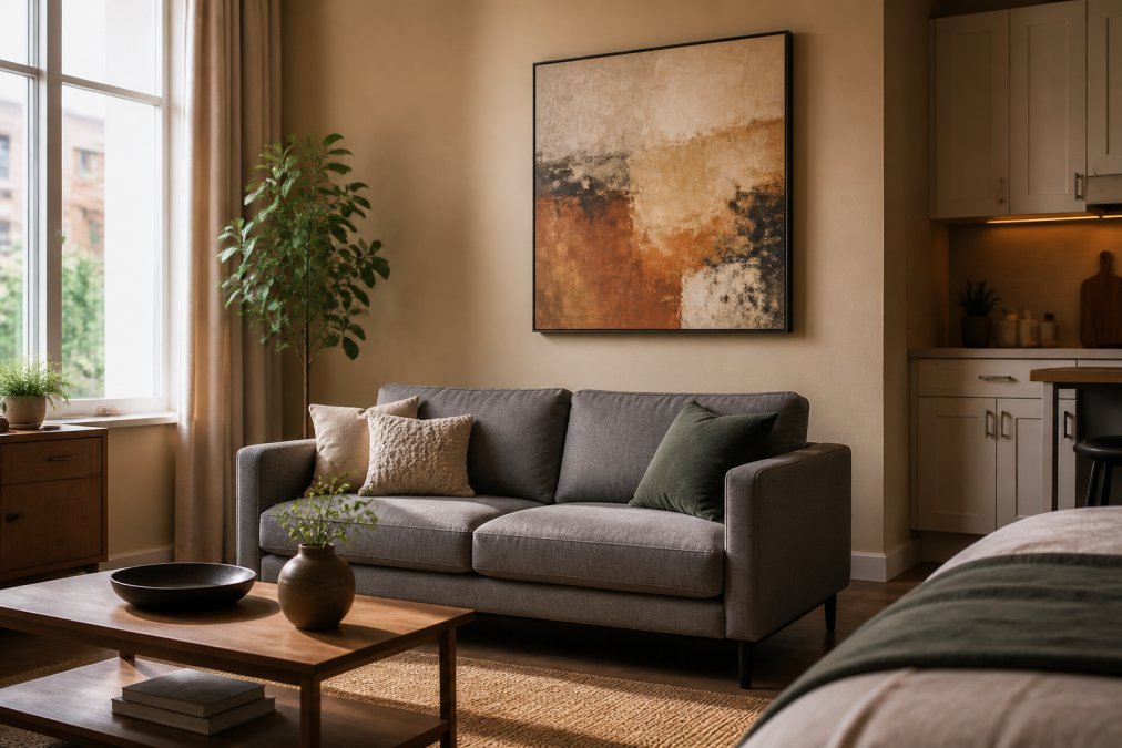
Interior designers are moving away from harsh contrast and choosing warmer palettes that integrate naturally with modern furniture and natural materials, such as warm beige, terracotta, muted olive, and sand. These earth tones create a calming atmosphere that makes small spaces feel intentional rather than cramped.
Consider your wall color first. A white or off-white wall gives you the most flexibility, nearly any artwork will pop. Colored walls require more careful selection. If your walls are a soft gray, warm beige, or sage green, choose artwork that either complements or intentionally contrasts with those tones. Avoid artwork that's too similar in tone to your walls, as it will blend in rather than stand out.
Textured wall art is replacing flat decorative prints. Textured paintings interact with light and create depth throughout the day, with buyers increasingly wanting handcrafted rather than mass-produced artwork. In small rooms, this texture adds visual interest and prevents the space from feeling flat or sterile.
Abstract forms work particularly well in small spaces because they don't compete with existing décor. A botanical print might clash with patterned furniture, but an abstract piece in complementary colors harmonizes with almost anything. This flexibility is why abstract art has become the default choice for interior designers decorating compact homes.
Gallery Wall Layout Ideas for Small Walls
A gallery wall done right becomes a focal point. Done wrong, it feels chaotic. The difference lies in intentional spacing and thematic coherence.
Cluster vs. Linear Arrangements
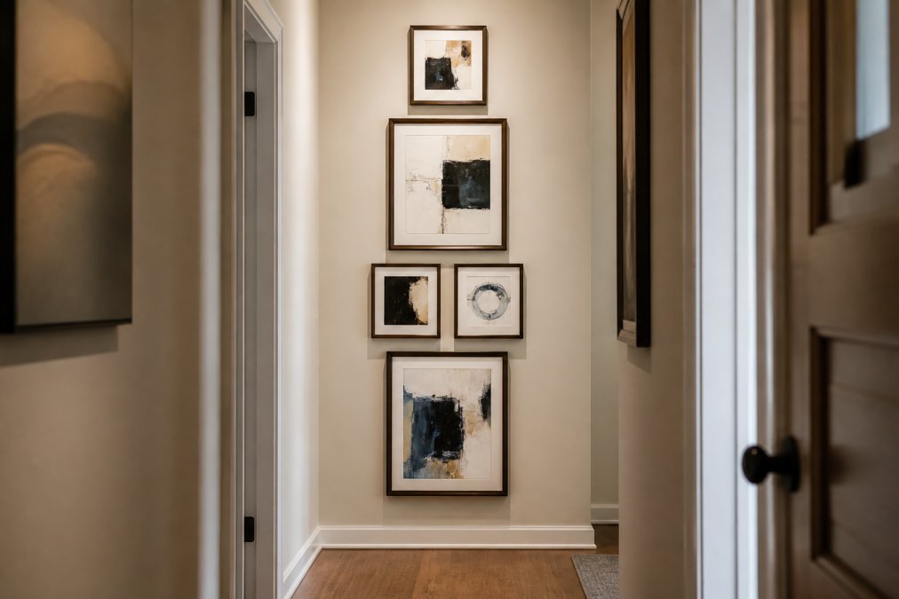
Clustered arrangements work better in small spaces than linear ones. A tight grouping of 4-6 pieces feels cohesive and intentional, while pieces spread across a wall in a line feel scattered and disorganized.
When clustering, maintain consistent spacing, typically 2-3 inches between frames. This creates visual unity. Vary the frame sizes and orientations (portrait and landscape) to add interest without feeling chaotic. The overall shape of your cluster should be roughly square or rectangular, not irregular.
Linear arrangements work only when you have substantial wall space. In small rooms, they stretch across the wall and emphasize the room's limitations rather than disguising them.
The key to any gallery wall in a small space is negative space. Don't fill every inch of wall. Leave breathing room around your cluster so it feels intentional rather than desperate. A gallery wall in a small room should occupy no more than 60% of the wall's total area.
Tips for Styling Abstract Paintings in Compact Homes
Abstract paintings are ideal for small rooms because they don't depict specific objects or scenes that might compete with your existing décor. They work with your space rather than against it.
Creating Visual Breathing Room
Visual breathing room doesn't mean empty space, it means intentional space. An abstract painting creates breathing room by giving your eye a place to rest and focus. In a small room packed with furniture, this focal point is essential.
When choosing art for small rooms, select pieces with some visual complexity. A painting that's too simple or monochromatic can feel flat. Look for artwork with layered colors, visible brushwork, or textural elements. These details reward closer inspection and make the piece feel more substantial.
The psychological impact of art scale matters more in small spaces than anywhere else. A piece that's too small disappears into the room. A piece that's bold and substantial makes the entire room feel more intentional and designed, not accidental.
Using Focal Points Strategically
Your abstract painting should be the first thing someone notices when entering the room. This means placing it where the eye naturally travels, usually above a bed, sofa, or dresser, or on the most prominent empty wall.
Once you've established your focal point, arrange other décor to support it rather than compete with it. If your painting features warm earth tones, incorporate those colors in pillows or throws. If it's a cool-toned abstract, let your furniture echo those hues. This creates cohesive design that makes small rooms feel larger because everything feels intentional.
Placement and Hanging Height
Proper placement determines whether your artwork enhances or diminishes your space. Height matters more than most people realize.
The standard guideline is to hang artwork so its center sits at approximately 57 to 60 inches from the floor. This is eye level for most people and creates natural engagement as you move through the space. In small rooms, this consistency across multiple pieces creates visual flow that makes the space feel more organized and intentional.
Above a sofa, hang artwork so the bottom edge is 8-10 inches above the furniture. This creates visual connection without feeling cramped. Above a bed, follow the same rule, 8-10 inches of space between the furniture and the artwork's bottom edge.
For gallery walls, measure from the center of the entire cluster to the floor. Aim for that 57-60 inch center point, then arrange your pieces around that invisible line. This creates visual balance even when individual pieces vary in size.
In small rooms, avoid hanging artwork too high. Artwork near the ceiling makes the room feel smaller because it emphasizes vertical space. Keep pieces at eye level or slightly below to make the space feel more intimate and intentional.
Renter-Friendly Art Solutions
If you're renting, choosing art for small rooms becomes even more strategic. You need solutions that work without permanent damage and that move with you to your next place.
Damage-free hanging strips are your friend. Modern adhesive strips hold surprisingly heavy artwork without damaging walls. For most abstract paintings, strips rated for 16-25 pounds work perfectly. Test them on a small section first, but they're genuinely reliable for temporary installation.
Canvas wraps and unstretched prints are ideal for renters because they're lightweight and easy to move. They also work beautifully in small spaces because they create a seamless, gallery-like aesthetic without heavy frames.
Consider rotating artwork seasonally. If you own several pieces, hanging different work in different rooms keeps your space feeling fresh without requiring major rearrangement. This is particularly effective in small spaces where one piece dominates the visual landscape.
Susan Fielder Art offers pieces that work beautifully in rental situations. The emotionally resonant abstract paintings are designed to transform any space temporarily, and their original craftsmanship means they'll appreciate in value rather than depreciate. When you move, you're taking an investment with you, not leaving behind a decoration.
Choosing art for small rooms isn't about accepting limitations, it's about using them strategically. The constraints of a compact space actually force better design decisions. You can't hide behind excessive décor, so every piece must earn its place.
Start with one bold abstract painting in a complementary color palette. Hang it at eye level, ensure it's proportionally balanced with your furniture, and let it anchor the room. From there, you can add a carefully curated gallery wall or keep the space intentionally minimal. The choice depends on your aesthetic, but the principle remains the same: thoughtful selection over quantity.
At Susan Fielder Art, we understand that small spaces deserve exceptional artwork. Our collection of emotionally charged abstract paintings is designed to transform compact homes into intentional, sophisticated spaces. Each piece reflects a narrative of healing and resilience while adding visual breathing room to your walls. When you choose art that speaks to you, your space becomes more than just functional, it becomes a reflection of who you are.
Frequently Asked Questions
What is the 2/3 rule for wall art?
The 2/3 rule states that artwork placed above furniture should be approximately two-thirds of the furniture's width. For example, if your sofa is 6 feet wide, your art should be around 4 feet wide. This proportion creates visual balance and prevents the piece from looking too small or too large for the space. In small rooms, this rule helps maintain proportional balance without overwhelming the area.
Does large art make a small room look bigger?
Yes. Strategic art placement can increase perceived room dimensions by up to 30%, a phenomenon called 'visual breathing room.' One bold, oversized statement piece draws the eye beyond physical boundaries and creates a focal point that makes the space feel more expansive. However, the key is choosing one larger piece rather than filling walls with multiple small works, which can create visual clutter and make the room feel cramped.
How high should art be hung in a small room?
Hang artwork at eye level, typically 57 to 60 inches from the floor to the center of the piece. This standard applies to small rooms as much as larger spaces. Hanging too high or too low disrupts the room's visual flow and makes the space feel disconnected. In compact homes, proper hanging height becomes even more important because it anchors the room's composition and guides the viewer's gaze naturally.
What kind of art makes a room look bigger?
Abstract art with earth tones, organic color palettes, and vertical orientation works best for small spaces. Warm beige, terracotta, muted olive, and sand tones integrate naturally with modern furniture and create a calming atmosphere. Textured paintings that interact with light add depth throughout the day. Photography pieces, particularly landscapes, are preferred by 62% of homeowners and nearly half choose landscapes specifically. Avoid heavy, dark colors or overly busy compositions that can feel claustrophobic.